It’s unusual for a financial payments company to have an in-house hardware product design team, but you soon discover that Square thinks outside the box.
The company was founded in 2009 by Twitter CEO Jack Dorsey and financial business entrepreneur Jim McKelvey, and launched its first app and service in 2010, along with its own compact credit card reader with smartphone connectivity, enabling payments to be taken everywhere.
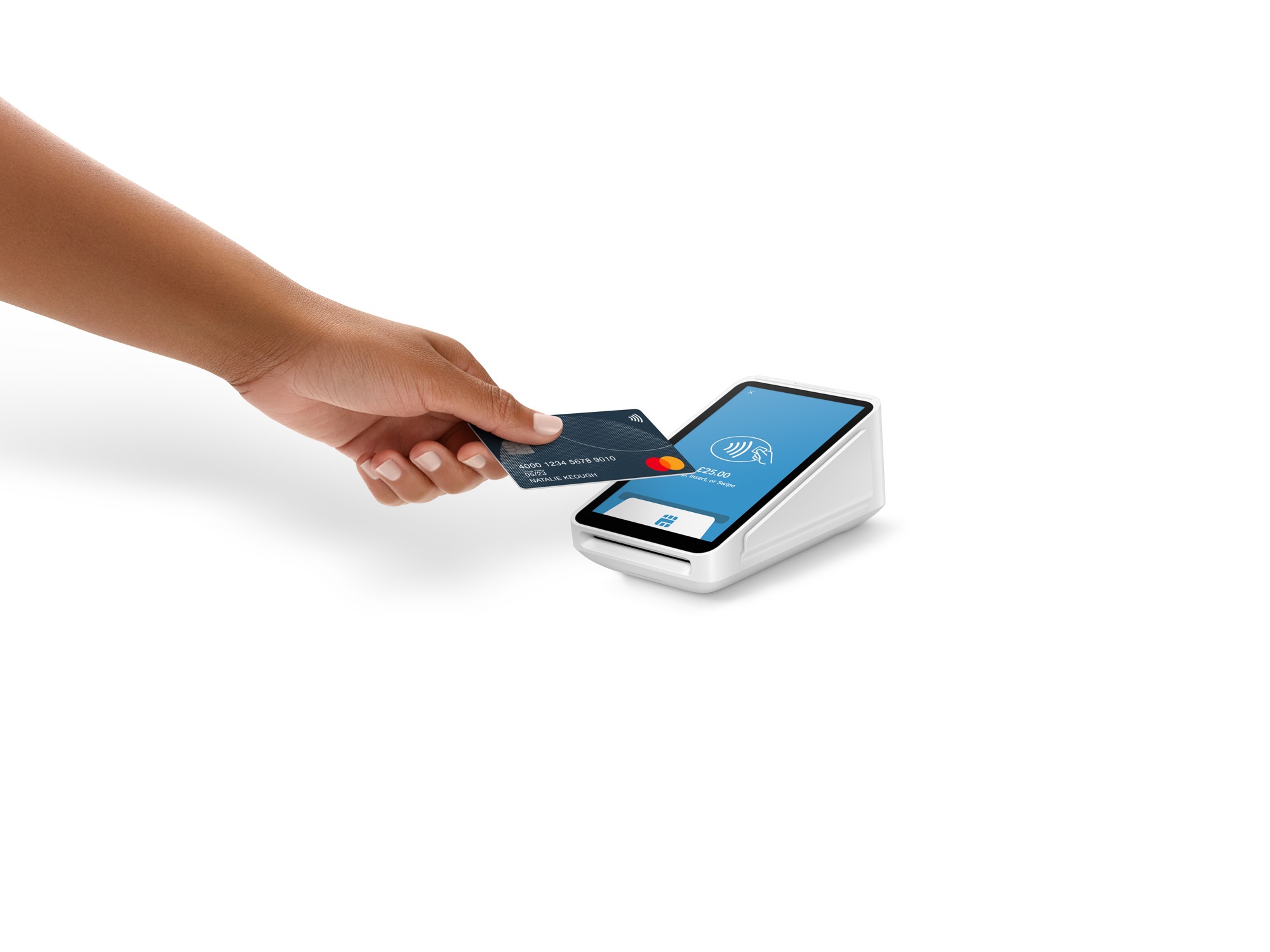
Chances are that if you’ve ever paid for something at a market stall or a food truck, then you’ve come into contact with the company’s original revolutionary design, the Square Reader, for quick chip-and-pin and contactless payments.
Inducted into the pantheon of great designs at the Museum of Modern Art in New York, the Square Reader set the stage for the company’s ongoing pursuit of design excellence.
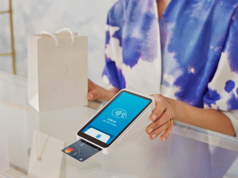
Cut to today and Square Terminal is the latest piece of hardware to emerge from the company’s San Francisco headquarters.
The brief was to build a fully integrated point of sale (POS) device, taking care of the connectivity issue and allowing bigger businesses that don’t want staff fussing with their personal phones or to manage a fleet of tablets to have a mobile system that’s all-in-one and works straight out of the box.
A product like this requires intuitive simplicity, and few are better positioned to deliver this than Square’s hardware design lead, Jesse Dorogusker.
The former director of engineering for Apple’s iPod, iPhone and iPad, and prior to that, chief technology officer at the highly regarded REM Design, Dorogusker brought his experience from the consumer product field into the realm of finance.
“It’s really nice to bring the ideas of modern consumer product design to an industry that really has been left behind with that kind of thinking,” he says, settling into his seat at Square’s London offices, flanked by a small flight case containing a prototype Terminal.
“As sophisticated as banking and moving money around the globe has become, it really hasn’t focused on the consumer. And it hasn’t brought the levels of product design that we’ve seen in other industries like phones and tablets.”
Being a relatively young company in a slow-moving industry presented Square with the benefit of adopting modern technology platforms from its earliest days.
Card payment machines have been around a long time, but as the US only recently moved from ‘signing the cheque’ to chip-and-pin or contactless, lots of businesses were caught out.
“Right out of the box, we were able to accept Apple Pay and Google Pay, which were new and sexy, and manage that transition. And still, around the world, we see these terrible machines that are just time capsules!” he says.
“You know they do the one thing they do, which is fine, but they are not opening customers up to the big world of software.”
Square – Command sense
Dorogusker runs through some of the trends his team uncovered: that there’s over a billion credit cards issued out in the world; that people don’t like carrying cash; but that they do enjoy the ease of using contactless.
Then, there’s the growth in phone payments. “The convenience of doing it on your phone is great,” he says, adding: “I don’t feel great about tapping a $1,000 computer onto another computer to pay for a coffee – but it works.”
There’s no question that the mobile phone will play a very important role in the future, but the biggest market is still based around card payments, and it was for this purpose that Square has designed Terminal.
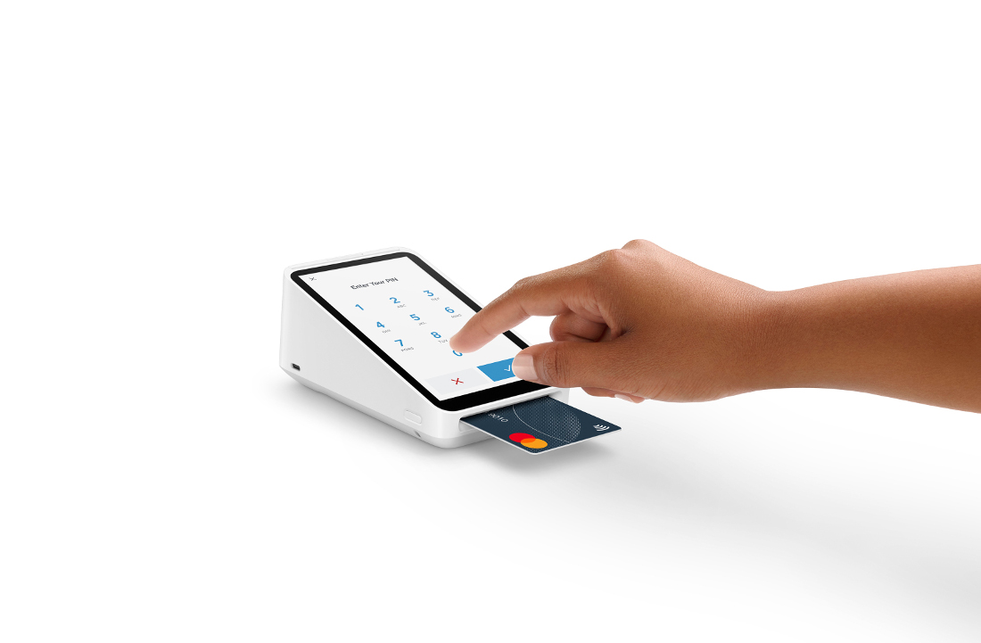
A lot of what Square’s design team did was to make the device instantly familiar to someone who’s used the payment terminal before: the ‘wedge’ shape, the default screen that comes up, the physical receipt.
“But since it’s running modern software, real platform technology that we built in the modern era, you can tab over and suddenly be in your item library,” says Dorogusker, swiping through the user interface (UI) on the model in front of him.
He calls it the Command Centre – a place to marshal inventory, set-up prices, issue refunds, or send invoices: “Something that modern payment terminals can do and legacy payment terminals can’t.”
Being able to pack so much capability into a device means that the UI and the physical product have to be simple and intuitive. “That simplicity is [there] because the company fought very hard to keep products from getting complex,” he explains.
“This thing has one button, there were lots of reasons to have other buttons.” Every internal battle fought over the design was about simplifying the product even further, he continues.
“There are many people who don’t have that design principle, that there are buttons and colours and schemes, fonts, and just an array, obviously designed by multiple people with not a lot of discipline or a lot of interest in simplifying the product.
Something we get from our CEO on down is to keep it as simple as possible,” he says.
“It’s not just ‘simple’ as a fun mantra: simple is the best way to include as many people as possible, young and old, [those] used to technology, not used to technology, trained on prior point of sale systems, experienced restaurateurs, [those] new to business.
We have to include everyone. And when you get too complicated, you lose people very fast.”
Squaring the wedge
While Square Reader was a dinky, pocketable device, Terminal, while still light and compact, has a form defined by the early decision to keep the paper till roll.
The first mock-ups for Terminal were basic forms. First, pieces of foam were cut to the size of different smartphone screens, with the names written on them in marker pen, before a paper till roll was taped to the back of them.
“We laid them all out and just got a sense for the physical proportions,” says Dorogusker, pulling a disassembled Terminal from the flight case next to him to better demonstrate how all the parts fit together.
“We didn’t want to pick a custom paper size, we need customers be able to buy paper in a normal way. We weren’t interested in reinventing the size and shape of a paper roll!”
Internally, the battery sits mid plane, next to the payments module, while the contactless reader is under the glass of the display.
“All the payments, security, the very deep-in-the guts firmware updates, live in this module. And then there’s the main board, which runs the entire operating system, UI, touchscreen, graphics and the printer.”
To set about digitising all the components and casings, the design was built in 3D CAD using Solidworks, before a huge number of iterations began, both as visualisations and as physical prototypes – with good reason.
“We do renderings, but you know, I’ve been doing this for nearly 30 years and I’m really good at looking at renderings and understanding what I’m looking at. And I still learn things when we take our rendering to a model.
Every time,” says Dorogusker. “Every time, something about a shadow, something about the way that feels, something about the materials, you can’t quite get the materials right.
You can do a rendering and do a lot of ray tracing and get all the shadows and think you’re emulating the materials perfectly, but there’s no motion to it. You have to move around a device that’s going to live in a physical space.”
Dorogusker explains that one angle of questioning he adopts in the team’s design reviews is: ‘What did you think when you saw the rendering? And now what do you think now that you’ve seen the model? And why do you think you didn’t catch it the first time in the rendering?’
He says: “You figure over time that you’d get expert at looking at a rendering and being right about it. And I’ve just given up on that. You can’t really get a feel for it. There’s no emotion.”
Square – Physical gains
The physical prototypes quickly evolve from foam beginnings, progressively getting more sophisticated with 3D-printed parts and machined mock-ups, with manufacturing considerations a key driver.
“One of the insights that I’ve learned throughout my career, and especially at Apple, is that when you’re designing something, if you’re not considering the means of production, you’re kind of foolish.
You have to own the design implementation at the same time,” explains Dorogusker.
After the design is locked in with initial prototypes, the design team go straight to steel tools, injection-moulded plastic and real circuit boards from manufacturers to get the manufacturing processes honed down as quickly as possible.
“You learn more, you get better fidelity as to what the end product is going to be, and you can learn if any of your design assumptions were wrong, or anxious, or somewhere in the middle.”
The design for Terminal was heavily refined and tested internally before anyone outside the organisation got to lay eyes on it. However, when it was finally placed in the hands of users, the iterations took on another life.
“Customers often will ask for a lot of complexity, which in retrospect, they don’t need. So, it’s our job to be a little bit of an editor on what they’ve come through with and really simplify it for them.”
Limiting moving parts and ports was a challenge too, but one that Dorogusker approached in a similar way to that seen at a former employer.
“It’s one of the reasons, probably, that Apple moved away from the removable battery concept. Because to do that, you had a battery door, you had battery contacts, you just had a lot more surface area for customers to get themselves in trouble.”
As an example of negating this hazard through design, and with the need to refill the paper rolls, Terminal’s paper dock is designed so that the door is easily removed.
“You can pop it back in – it was a fun design task. Okay, we’ve tried to make this as simple as possible, and then complement it with software that knows that the door’s open and put back in correctly.”
The standard camera mount fitted into its base opens the device up to numerous modes of use: for example, it can be anchored to a cashier’s desk; attached to a chest strap on a shop floor; hooked onto a belt in a restaurant.
This should open up new opportunities in sectors where Square hopes to flourish. “There’s a baseball stadium in the US that’s using these all around the stadium,” Dorogusker reports.
“[It’s] one of the last places that is exclusively cash. Buying a beer from your seat – just cash, and you run out eventually, sometimes by the third inning!”
Given America’s fast-growing adoption of contactless payments, the product’s simplicity of use, and the seamless blend that has been achieved between its software and hardware, the Terminal looks set to chalk up another home run for Square.