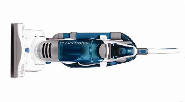
Let’s face it – unless you’re Freddie Mercury – vacuuming is a bore. However, if your vacuum cleaner is simple to use, can be manoeuvred with ease, doesn’t require any bending, winding or stretching and is also good to look at, you may just enjoy it that little bit more. This is exactly what Electrolux set out to achieve with its latest product offering – the aptly named @ease.
“Vacuuming isn’t seen as the most fun thing to do – there is physical effort involved and it takes time. We wanted to make that easier and more enjoyable for people,” says Randy Sandlin, general manager of consumer experience and innovation at Electrolux Home Care Products, who was responsible for bringing the new @ease to market.

The @ease eliminates stretching bending or winding. All controls are either hand or foot operated for ease of use.
Electrolux, a global appliance brand that sells more than 40 million products including refrigerators, dishwashers, washing machines, vacuum cleaners and cookers to customers in 150 countries every year, prides itself on being a ‘Thoughtful Design Innovator’. This means that it wants to be portrayed as a customer-focused company that is dedicated to creating innovative and thoughtfully designed products that meet the real needs of customers.
This may all sound a bit like ‘marketing fluff’ but according to Sandlin, extensive consumer insight really does drive the product development. “At Electrolux, we have a thoughtful design philosophy. It starts with the consumer – identifying their needs and finding ways to deliver on them. We then look at functionality, usability, how people actually interact with the product, aesthetics and capturing the brand identity. It’s really a holistic approach to the product. It’s the total experience,” he explains.
Global design
Electrolux has its design roots in Scandinavia, a region renowned for its clean and simple yet intuitive creations. The company’s headquarters are in Stockholm, Sweden, but the industrial design team, that consist of 140 designers, model makers, surface designers and project leaders, are also spread between Electrolux Design Centres in Porcia, Italy; Curitiba, Brazil; Sydney, Australia, Singapore, Anderson, California; and Bloomington, Illinois.
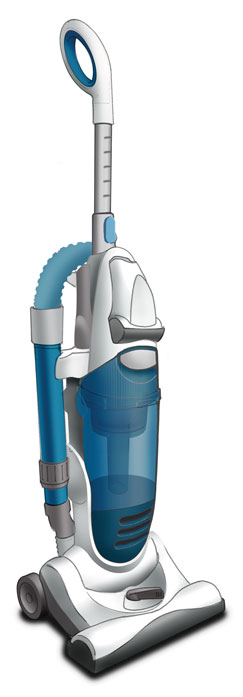
Concept development of the
@ease was carried out using Alias
However, despite being geographically dispersed, Electrolux’s designers don’t work in isolation. Not only do they collaborate on projects with their design colleagues in Stockholm but they also work as part of an integrated team in-house that consists of both engineers and marketers. “Good design happens when design teams work with other departments to ensure that essential brand aspects are seamlessly integrated into the product,” says Sandlin.
Consumer appeal
Every project starts with consumer insight and instead of the industrial designers merely relying on what the consumer researchers tell them, they actually go out there and get involved in the research themselves. Sandlin refers to this research as ethnographies, and it involves actually going into people’s homes to observe them using their appliances and products. “You can’t make a product succeed without knowing for whom it is intended,” he says.
“A good design is born when a product answers a specific need existing in the real world and this can only be accurately determined through interaction. Ethnographies are the best way to achieve this interaction.”
Interaction with consumers doesn’t stop there as throughout the design process focus groups are held, which the designers also attend. “Understanding that consumer first hand – getting to see their body language and visually see how they interact with products – is so important because that is where you can get those big ‘eureka’ moments,” he adds.
In the case of @ease, the designers had several different areas that they wanted to explore based around making the vacuuming process easier for the consumer. One of the first things they wanted to look at was the cord and instead of the user having to bend down to wrap the cord, they wanted to look at the possibility of creating a button that they could push to automatically wind it in. According to Sandlin, although the cord rewind is common on canister vacuums, it is not heavily used on uprights.
Another design feature that came out of the brainstorming sessions was use of two zones on the product – one zone at the top consisting of buttons and interaction points controlled by hand and then a foot zone where users can change the height adjustment and access the on/off button. “From consumer insights we saw people bending or just not doing things because it took some physical effort and we wanted to avoid that,” explains Sandlin.
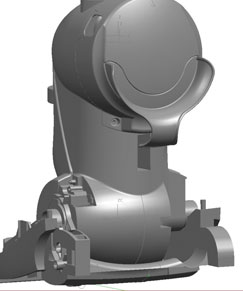
The internal components and external structure are developed using Unigraphics
With the consumer opportunity identified, the design process – which Sandlin refers to as a pretty in depth stage gate process – now begins. It either kicks off with a primary development, which is when a new technology needs to be developed, or, as in the case of @ease, progresses straight into concept development. Here the designers and engineers worked together to come up with concepts that incorporated the cord rewind, telescopic handle and telescoping wand. They then constructed some very quick engineering rigs. “These are not beautiful,” says Sandlin, “but you can mess with them and can cobble some stuff together from other projects to get some kind of prototype to interact with.” The designers will then start working on concept sketches and utilise Alias software to create renderings.
Product development
Having identified the segment they want to go after, found the consumer need they want to focus on, established the business case, and what timeline they are working towards, the designers can then move into the product development phase. In the first stage they will continue the design exploration. “We do a more in depth dive into how we are going to make all this work – from a technical and a design side,” says Sandlin. So, whilst the designers create their external surfaces in Alias the engineers will be working on the internal components using Unigraphics. The designers and engineers will then both work in Unigraphics to build the structure. This is a very collaborative process as the designers and engineers will work concurrently transferring files back and forth.
In order to test their designs and show how the product solution has been interpreted, physical models are produced, by sending CAD files to either the in-house CNC or SLA machines. “If we send a file to our SLA machine, the next day we can come in and see the parts to verify that design,” explains Sandlin. In the case of the @ease, testing the product’s height adjustment using your foot took rounds and rounds of prototyping to make sure that it was something easy for the consumers to do both with a shoe on and off. At this stage the US team can also get input from the Stockholm design team by sending the Alias files to them to review and give feedback on.”
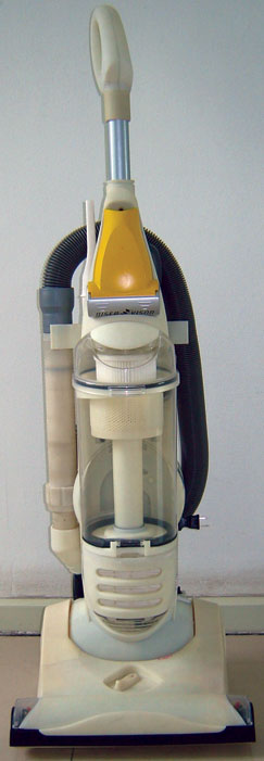
Rapid prototype models are produced in order to test designs and show how the product solution has been interpreted
Next is the ‘design freeze’ where everybody stops what they are doing and scrutinises the full size prototype to make sure that they are all in agreement with its size and features. “Our goal is that we freeze the external design and make sure that the engineering technicals will fit within that design,” says Sandlin. They look at things like the structure, the ribs and the parting line of the plastic parts. Doing this prevents costly and labour intensive changes having to be made further down the line.
After the design freeze there are various stage gates that the team needs to go through including the engineers working on finishing external surfaces in Unigraphics and release tooling. “When we get parts back from tooling, we will do reviews. Engineering will review it from all their technicals and we will review it from an aesthetic and consumer interface side,” says Sandlin. Towards the end of the process when they are nearing production, they carry out a final review of the product checking that it fulfils the original design intention that was set for it. “Part of the development is focussing on what you want to do and not making compromises on those areas,” he says.
Colour me beautiful
An important area that the designers need to consider before the product goes to production is the graphic application and colour. “We have to look at the colours we are going to use and how we are going to communicate the brand and the features with the graphic on the product,” explains Sandlin. In the case of @ease – white with cyan and then white with magenta were chosen for the two different models. “We use splashes of colour, which is very fresh and new compared to what is happening in the category with other products just being one colour. Colour draws the consumer’s eye to particular features and details,” says Sandlin. Interestingly, consumers in the UK and European markets have different feelings towards colour compared to the US market. “White with magenta does well in the UK but doesn’t get the same response when we do colour research in the US,” says Sandlin. “In the US we did a similar model in grey and they reacted differently.”
Production ready
When the product is ready for production, communication with the factory is done through the engineering group that sends the 3D CAD data. Like many companies, Electrolux wants to remain competitive and that involves cutting costs and so it has embarked on a comprehensive restructuring program. By the time this program is completed in 2010, approximately 60 per cent of the group’s appliances will be produced in low-cost countries, including Poland, Hungary, Mexico, China and Thailand. The company is also saving on its purchasing costs, mainly by increasing the share of purchases from suppliers in these low cost countries.
The @ease was launched in September and despite a difficult market, Electrolux is hoping that with its foot operated controls, looped telescopic wand and 8m cord auto rewind it will stand out from other products in the category and connect with consumers. As for Sandlin, after 15 years with Electrolux his enthusiasm is not waning. “There are so many unfulfilled needs out there that need to be solved. So when we start the next project, it’s a new set of consumer problems that we are tackling – we are not doing the same product over and over and just making it look a little different,” he says. “They all start with that consumer problem and you dive in to find out how you can make that product better for the end user. That’s what makes it really fun.”
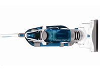
The new @ease from Electrolux is designed to make cleaning fun

