Matchimatchi lampshades explore the creative potential of the lampshade – bolstering the staid old ceiling adornment into an item that creates a unique diffuser that can constantly grow and evolve.
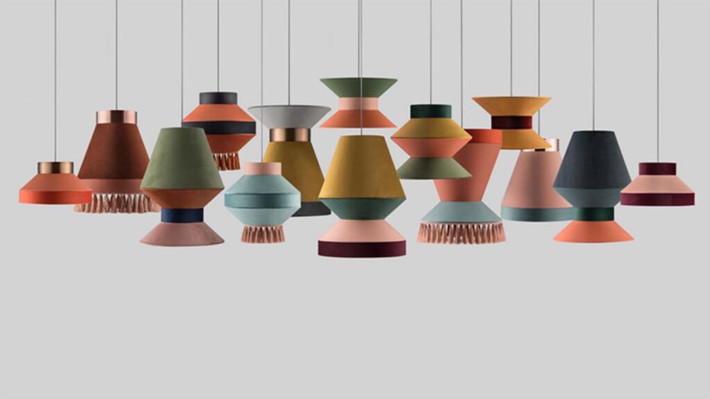
Emphasising form around function, the shapes, textures and colours can connect in a variety of ways to immediately change a room’s appearance.
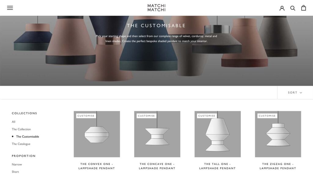
“We use just 4 shapes of shades that ‘click’ together in an infinite number of ways to give the user the creative freedom to build, change and update their own interpretation,” says Matchmatchi co-founder Scarlett Hampton.
The shade has traditionally been a low impact, ‘throw-away’ lighting solution for millions of homes, hotels and restaurants – a less considered purchase than something like a chandelier.
As Hampton explains, the shade has only ever been focused around function with a limited exploration of its form. “It is what it is!”
“Maybe you like the colour or the fabric or the size and shape? But once it’s up, it’s up. Shading the light without a second thought.”
Matchimatchi’s brief was simple: take the thing that everybody wants and allow it to be whatever they want it to be. “Combine whatever colour, with whatever fabric and in whatever size and shape you want… and best of all, if you ever get bored of it, change it without buying something else.”
Customers can add a different colour, a different shape or simply rearrange what they already have and make it new again.
“And better still, why not hang three in a row and combine the shapes of each shade so they tessellate?” says Hampton. “Why have three the same?”
The reality of the project wasn’t a team of designers pouring over mind maps and concepts and making hundreds of prototypes; it was based on that simple idea of being able to hang three shades in a row that tessellated.
“To do this we needed to be able to make ‘sections’ of a shade that attached to one another, top or bottom and with hidden and un-mechanical fixings.” says Hampton.
“A fixing that could be housed in a similar ring to what is currently used and small enough to allow fabrics to be rolled around as they currently are. Also, with any one of these sections being positioned at the top and in either direction, we needed a way to fix the entire combination to a lamp holder, without every shade having a ‘gimbal’.”
The final design has been granted a patent covering the way the shades connect together and also the design for the removable gimbal, which can fit in any of the shades in any of the apertures.

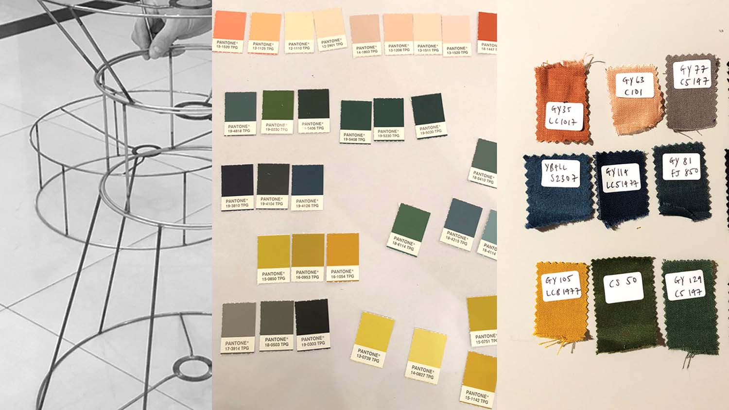
Once the technical hurdles were overcome, the team moved on to the fun task of creating the colour palette and fabric selections for the first design series.
“We needed a sophisticated palette that allowed for enough colour and texture options for people to be truly creative but at the same time refined and coherent enough so not to overwhelm people.”
All this was done ‘back to basics’, “no fancy software here!” remarks Hampton, who relates how they sat down with a huge selection of fabric swatches and began to group them together by hand.
The end result was a palette of 24 colours, textures and tones that work in harmony together to form the Matchimatchi range. The mixture of soft linens, deep velvets and rich metallics work together to allow each shade combination to be as bold or as subtle as the consumer prefers.
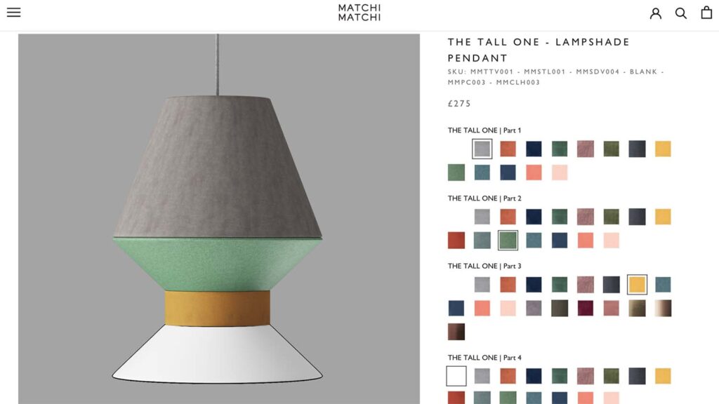
Allowing the customer to explore these different configurations was the next challenge, with Matchimatchi aware that it needed a simple and creative way for customers to visualise their customised lampshade on the website.
Working closely with its website developer, Matchimatchi set out to design a configurator that was simple, colourful and easy to update with more shade shapes and materials as our brand grows, as well as being quick to load.
“The solution we found was to render the components, and then our developer assembled them on the product page – he said it’s been one of the most difficult but rewarding projects he has worked on.
“Each element was rendered on a transparent background and the renders sit on top of one another to create the full image (lampshade combination).
This keeps the image sizes down, it means we can quickly add or take away options, and allow for a very elegant shopping experience.
“What we really love about the fabrics and shapes is that the possibilities are endless. Already we are curating a range of rattan solutions and printed fabrics that can further enhance the shade, add more options for our customers and add infinite intrigue. Our lampshades will have a life less dull!”


