Freshening up water
Water, in poetic terms, is the key to life and the elixir of health; in reality it’s a bit dull, often tastes horrible and can contain some nasty stuff.

The brief for the Grayl water filtration cup was to create a device that not only made water
Depending on where you are in the world the water quality varies greatly, and the implications to your newfound health kick can be impacted.
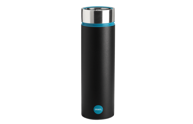
Few are as eye-catching or practical as the Grayl, a beautifully designed flask containing a filter for everyday use, removing 99.99 per cent of bacteria from your normal tap water experience.
Additionally, for outdoor types that like drinking from natural sources while frolicking amongst nature, or travellers spending time in less than sanitary conditions, a purifier can be added to remove horrors such as E. coli.
The G3+ filter is not a mechanical filter, instead it uses electroadsorption – relatively large pores that are overlaid with a positively charged mesh (think: little magnets) that latch onto germs.
The large surface area of the filter, which pushes down into the water in 15 seconds, works the same way a cafetiere filters coffee, massively reducing pressure.
This means no pumping, squeezing or sucking to force the water through a more typical filter.
Designed by a Seattle-based start-up led by its CEO Nancie Weston, the Grayl was targeted to be as aesthetically fitting for use in both the office or halfway up a mountain.
Using premium materials, being simple to use and benefitting from being an all-in one design, the aesthetic properties of the Grayl were kept minimal.
SolidWorks was used to design the 3D models, while prototypes played a key part in the 17-month design process. Many were hand built to prove the concept; 3D printing was used to test the filters.
Working with scientists, the cup’s filter seals had to be proven to work otherwise it wouldn’t be safe to drink from a cup that would also contain possibly contaminated bodies.
A tight-fitting design was proven through a handful of final factory prototypes, and the product has blasted through its Indiegogo crowdfunding to reach market.
thegrayl.com
//www.youtube.com/embed/3J_yeQrfUOc
Healthy eating blitz
The original Vitamix blender was built in 1937 and following decades of refinement is now a kitchen staple for the health conscious.

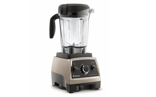
The latest Vitamix blender, the Pro 750
Blending to quickly and easily prepare healthy foods that taste delicious is something most food processors can manage, but the Vitamix has added versatility.
Aside from the usual chopping and blending (no need to peel or pip, everything will get blitzed meaning more nutrients), the ingredients you throw in can even be heated – using no heating element, just friction – meaning fresh soups take seconds.
Adding ice to the mix results in ice cream, and to clean you simply throw in some detergent and warm water and it cleans itself.
The latest machine, the Pro 750, was designed around customer demands for a quieter machine, lower in height and styled to fit a modern kitchen.
PTC Pro/Engineer was used for the in-house engineering, while the industrial design work was done in PTC Creo by a third-party, passing the models back and forth between the teams.
“These two requirements clashed at numerous times and resulted in many extra iterations to achieve both,” says Vitamix vice president of engineering Greg Moores.
“The sound level was physically determined by airflow in and through the machine, and the relevant surfaces over which the air flows in many cases were exposed to the exterior, thus impacting the design and leading to many discussions (sometimes heated!).”
An in-house FDM machine along with third-party bureaux provided some prototyping parts, although soft tooling was favoured at various stages so that test parts could be made of the correct production materials for physical tests.
Vitamix is rapidly morphing from a traditional ‘build and test’ product development methodology to one using 3D simulation.
Already the team is looking toward using CFD and FEA elements for next generation designs that will furnish the healthiest homes.
vitamix.com
Very personal trainer
Running is one of the cheapest and most productive forms of exercise you can do, but getting some expert coaching can be the impetus to push yourself further and faster.
Eschewing the traditional nagging, perma-tanned, human personal trainer, you can equip yourself with an ever-present wrist device that can monitor you 24 hours a day.
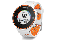
The Garmin Forerunner 620 is one of the lightest, thinnest, most advanced wrist-worn monitors available.
An accelerometer allows it to measure cadence (the number of steps per minute), the total steps taken, vertical oscillation (the bounce in a runner’s running motion) and even ground contact time measured in milliseconds.
When used with a heart rate monitor, it incorporates several pieces of data, like running speed, beats per minute and heart rate variability, into an advanced algorithm to estimate a runner’s maximum volume of oxygen use per minute (VO2 max).
Based on the VO2 max estimate, the 620 can predict a runner’s race time for several distances, setting time targets for their next race, suggesting recovery workouts and even rest days.
To keep the user motivated the watch also notices if runners hit any personal records on their run, like their fastest mile, 5k, 10k, half or full marathon or their longest run to date.
Garmin’s in-house industrial design team leads the aesthetic and ergonomic development of projects, collaborating with its engineering and marketing teams to explore, innovate, and execute its designs.
Sketching using Wacom tablets is preferred, before moving concepts into SolidWorks.
To explore a wide variety of styling options such as forms, colours, finishes and materials, the products are rendered in a variety of styles using Keyshot.
garmin.com

Products designed with well-being in mind
Default


