At the end of last year, Al Dean discussed the potential benefit of having a wider range of third-party apps available via the cloud. This month, he’s pondering how effective the user experience will be compared to the desktop

SimulationHub’s service offers CFD that’s easy to use – but there’s a sticking point with its user interaction standards
This month, I’ve been preparing a feature on the range of third-party, cloud accessible applications available for Onshape.
While it’s an interesting proposition, it’s worth asking how cloud-based apps like these compare to existing desktop software options.
Cloud applications, after all, should work together more efficiently than perhaps some of our desktop apps do.
By way of evidence, look at the level of integration offered by consumer-focused cloud services: if I’m uploading a video from my Dropbox account to Vimeo, the transfer process is pretty painless and a lot more efficient than downloading the file to a local drive, then re-uploading it. And believe me, when it’s your job to upload all of the videos taken at each year’s DEVELOP3D Live event, you really do want to save as much time as possible.
What’s interesting is that this kind of seamless integration experience is now being delivered by design and engineering tools in the cloud and there are some excellent examples of this out there.
This month, for example, we review SimScale, which offers a connection to the data you keep inside Onshape, if you use that service. You authorise the application and can move the data from Onshape’s server (presumably via some sort of STEP-based translation process) into a SimScale simulation study – job done.
There’s no bi-directionality or linking to that file at present, so it’s a bit of a one-hit wonder. If you want to update the geometry, you need to re-import it. But that’s likely to change over time, as both services mature.
But when you start to look at the more tightly integrated services, where you’re effectively using another service inside the Onshape window, a very different picture starts to emerge.
Let’s take the example of SimulationHub, a new start-up that’s focusing on making Comptuational Fluid Dynamics (CFD) more accessible. If you want to try it, you can, for free, on its own or connected to an Onshape account.
From within Onshape, you have your geometry, then kick off a SimulationHub session. This transfers the data into SimulationHub’s environment (and maintains a link), but rather than opening in another window (or browser tab), it becomes part of the Onshape environment.

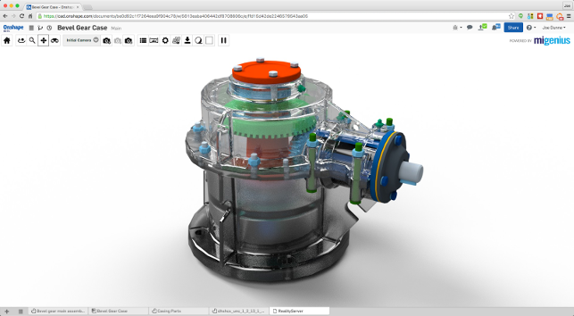
MIGenius’ RealityServer add-on service for Onshape. Look and feel is the same with a much slicker workflow to boot
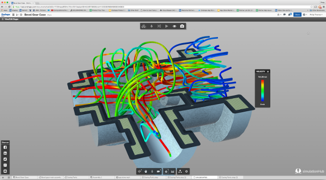
Even from looking at the screenshot above, it’s clear that SimulationHub’s user interface is completely different from that of Onshape. The colours are different, the user interface is starkly different (you might spot that SimulationHub uses Autodesk’s LMV API for its user interface), but you’re still effectively in Onshape’s window.
The differences, however, go way beyond pure aesthetics. Take mouse operations as an example: within Onshape, model rotation is performed using the right-hand mouse button. In SimulationHub, it’s the left.
This, to my mind, is going to be an issue.
Design and engineering is an iterative process and so is the way we use our tools. If those tools cause ‘sticking points’, with mismatched user interfaces and experiences, then workflow breaks down and becomes hampered by delays.
This is, by no means, a criticism of Onshape and its partners specifically. As I see it, it’s going to become a much wider issue as more vendors (both existing and new) move to the cloud.
The smarter partners will develop tools that work inside the host applications and adopt their look, feel and interaction methods (as a bare minimum).
An excellent example we’ve already seen is the work that MIGenius has done with its RealityServer offering for Onshape. This adopts the same model control and user interface style right from the word go. As soon as you switch to RealityServer within Onshape, it feels more comfortable, familiar and productive.
But is this any different to how things are on the desktop? The answer is: “Not really.” Yes, desktop software, particularly from the larger vendors, is mature enough for more strict guidelines to be enforced, demanding that third-party developers adhere to common user experiences. You can take SolidWorks’ Gold Partner integrated applications as an example of this.
These are, of course, the best examples, but more often than not, we’re looking at different workflows and different control methods between different vendors, if not between applications (often from the same vendor).
Will we see the same happen in the cloud, where we find differing levels of integration and more efficient workflows? I suspect it’s going to take some time, but it’s also something that must be addressed, sooner rather than later.
This might take the form of a set of regulations that need to be adhered to – but perhaps a better approach would be if software vendors themselves recognise the benefit of adapting their offerings to ease that workflow.
After all, those third-party application or services vendors that go to the trouble of putting customers first will surely benefit as a result.
Vendors in the cloud apps space frequently use Apple’s App Store business model as reference point. What Apple has done is build a successful ecosystem – one in which user experience is pretty much nailed down and enforced.
What the vendors in our space need to do is replicate that aspect of the model, too.
What can we reasonably expect from third-party partner applications, accessed via the cloud?
Default


