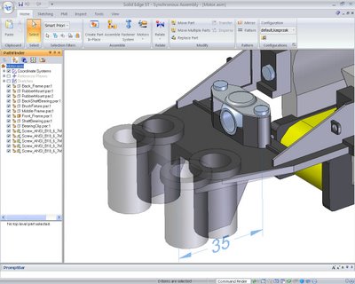
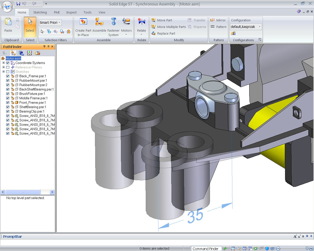
Solid Edge is now fully Ribbon’ed up
I’ve spent the last ten years or so writing about the technology we use day-in-day-out. What’s interesting is that as my career transitioned from designer to writer to publisher, the software within this space also went through a transition, from the UNIX-based hardware to the more cost effective Windows platform.
With that shift brought about a transition in user interface design. When CAD software ran on SGI, IBM-AIX or Sun Solaris systems, the user interface was pretty much up the development teams, they designed it (or didn’t in some cases) to fit the purpose it was intended for; hence, I-deas looked nothing like Unigraphics which looked nothing like AliasStudio. Which definitely looked nothing like Pro/Engineer. But things changed when CAD vendors adopted the Windows platform and things started to standardise – but even still, every application retained its own look and feel.
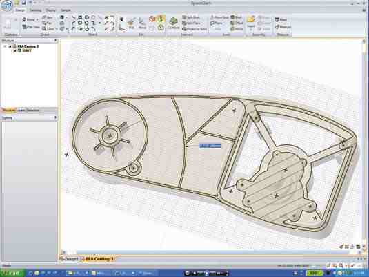
SpaceClaim was one of the first to adopt the Ribbon UI
But now, we’re seeing an even greater process of commonisation across the software within this magazine. The Windows Vista UI style, specifically, the Ribbon toolbar, is become the de facto standard for software vendors and user interaction. Look at the images on this pages, can you tell them apart at first or even second glance.

EFD.Lab from Flomerics latest release adopts the ribbon toolbar
In there we not only have SolidWorks, Solid Edge and SpaceClaim but also Flomerics’ EFD.Lab. The Ribbon toolbar is everywhere and seemingly omnipresent. So what’s my point?
I can understand the argument that familiarity with user interaction methods is a healthy thing. That if you use Word and Excel then you have immediate familiarity with the 3D design software and it eases the learning curve. This can be argued back and forth and I’m personally not convinced. Much of it, I’m sure, is the vendor appealing to the lowest common denominator. The majority of users, particularly within our readership, have adopted 3D design tools, but the vendors are still chasing the laggards, those slowest to adopt 3D and drive forward with it – and for those, the “its just like Word” might be a good sales line.
But if you look at each application, look at the technologies they use, there are common components; many use Parasolid, many user D-cubed, many use other libraries to provide their features and functions. If UI design is also standardised, where can the vendors find the room for innovation, for differentiation and how can they truly support the 3D-based design workflow? I guess the answer is that the Devil is truly in the details. How does your system allow you to work directly, but intelligently with your geometry and parameters of design? How do you use on-model interaction and context sensitivity to its fullest. Does your design system enable that? What additional tools has your vendor developed to assist with design, to make it more fluid – are things like SpaceClaim’s direct modelling approach, Siemens Synchronous Technology, the future or is there something else required? Personally, one of the most impressive UI updates I’ve seen in some time is the forthcoming NX 6 release that Siemens has just shown off.
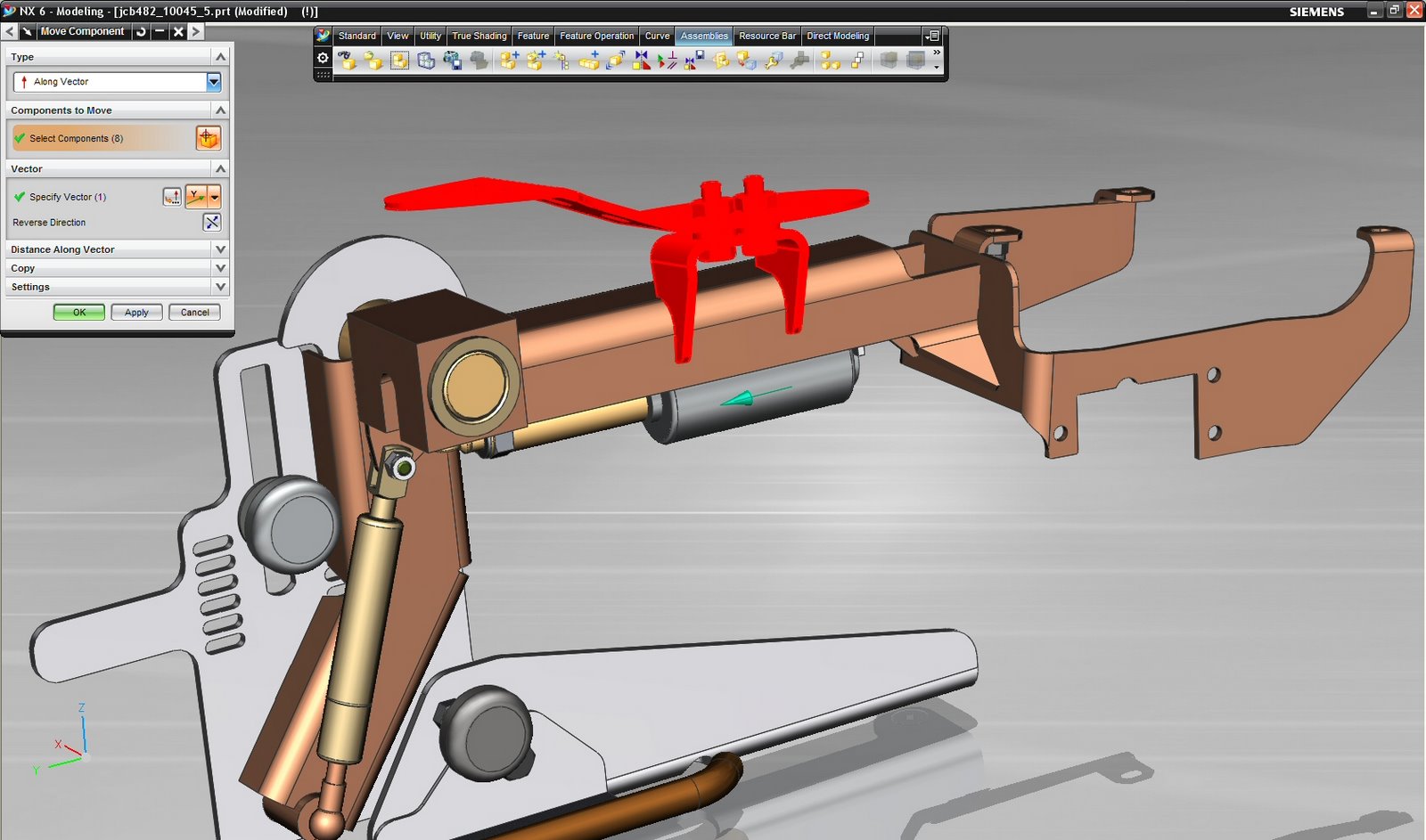
The new NX UI which sees no ribbon action whatsoever
Yes, it has the Sync Tech behind it, but more impressively than that, the UI is stripped down and minimised. Use of Roles allows you to have the commands you need for the task you re working, at hand and switch able, and the level of at cursor interaction and command/operation access is unbelievable and will make users way more productive.
And guess what, there’s not a ribbon in sight.
it seems that its not just me that’s been considering these things – Ralph Grabowski’s been pondering the same thing over at WorldCADaccess.