Twist and shout
Salt and pepper is the perfect marriage of condiments: a union found on the tables of the grimiest of cafes and the most glittering of restaurants. Any changes made to these classic dispensers have to be special.
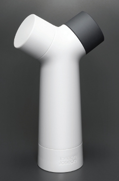
The Y-grinder is setting out to reduce the footprint of this essential table furniture with its clever duet of salt and pepper grinder in one. DesignWright (a team of two brothers, Adrian and Jeremy Wright) was originally asked by kitchenware company Joseph Joesph to come up with some ideas for a new peppermill.
“We came back to them with three concepts,” says Adrian Wright. “Two of them were for a singular pepper mill and for the other concept we thought it would be interesting to put salt and pepper together in one product.
“We wanted to come up with a solution that communicated that this product was different from others on the market – the Y-form almost allowed us to express ‘mixing’.”

The Y-grinder mill has a unique twin-chamber design allowing both salt and pepper to be dispensed from the same unit
Sketches were initially produced for the dual chamber grinder, but for a product that relies on its dexterity in the hand DesignWright preferred to make a series of simple cardboard models.
“When you grind pepper people are used to having a cylindrical form: put two hands on it, you grind and you find that your elbow is up in the air. We wanted to check that by using the ‘Y’ it would still be feasible to actually grind salt and pepper from it, and it would be pleasant to use,” explains Adrian.
The final designs and dimensions were proven in a 3D model so the team could move on to the final prototype stage with the aid of the manufacturers.
A fully working prototype was an essential part of proving the project, which consisted of 42 components. “The factory made an STL model prototype, and for the two gearboxes inside it, they were machined so they could make it in brass.”
“We wanted to really check it out from a visual point of view, from an ergonomics point of view, from a ‘does it communicate how you use it’ point of view, and also just checking that our design was feasible.”
The completed design is a universal hit, winning global design awards at prestigious red carpet events; the product however is just as happy on the kitchen table.
www.designwright.co.uk
Cut and run
Japanese cooking knives often hark back to an age of the Samurai – razor sharp, hardened steel swords – but the Toginon range of knives offers something a little more modern.
The kitchen knife comes with two blades and a sharpening and reconditioning service. When the blade needs sharpening it is sent back to the factory in the supplied envelope and the spare blade can be
used in the meantime – leading to a good-as-new knife for life.
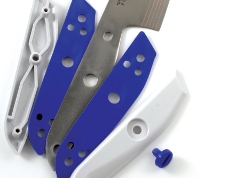
A ‘sandwich design’ of the handle means the blade can be easily removed by the user by simply unlocking it with a coin, and removing the rubber grip that also helps keep water out.
Robert Beagley-Brown of Beagley-Brown Design, developed the product with the Oribe Design Centre in Gifu, Japan, for client Shimizu Hamono.
“Firstly I researched knife technology, types, history and culture and carried out user research to understand how people use knives,” says Beagley-Brown. “Second was to sketch lots of concepts.
“The concept sketching and blade outline designs were done with Adobe Illustrator,” he continues.
“The handle shape was developed by carving plaster of paris prototypes and then the shape was replicated and refined using Rhino.
“Making physical prototypes and testing them with users is always very important. Refinement of the shape was done on the computer and I worked with the moulding company and the blade manufacturer to detail those components.”
The hardest part of the brief was to prevent rust forming on the 440C stainless steel blades – the hardest metal used for knife blades. “The client insisted on using a high chromium content stainless in order to get the best cutting edge but this meant any water inside the handle could cause rust spots.
“The solution was the sandwich handle design with rubber sheets to prevent water ingress.” The blade is protected by a copper alloy laminate to stop it from rusting and to provide an antibacterial coating.
“It was an incredible experience spending two months in Japan and working with this small family-owned company,” concludes Beagley-Brown. “I even got to visit a Samurai sword maker while I was researching the project!”
www.beagleybrown.com
Scrubs up well
Kitchens are not just home to creative culinary flair, but also tedious amounts of cleaning, tidying and other mind numbing drudgery.
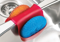
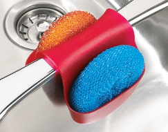
However, not all is lost as it gives you an excuse to splash out on your sink-wares like this handy soap and scrubber ‘saddle’ caddy.
Toronto-based designers Ross + Doell came up with the concept of it straddling the partition between sink bowls as part of a brief to design a simple kitchen product for under $10.
Concepts generated needed to be easy to install without tools or instructions because of the planned multinational distribution through homewares store Umbra.
Sketched-up by hand first, the team worked on the basic form and single piece shape using Autodesk’s Sketchbook Pro software.
From there a 3D model was built in Pro/Engineer, with emphasis on keeping the model similar to the concept designs, but with practical boundaries added for manufacture.
The simple shape of the design was one of the most difficult elements to achieve for designer Mike Doell, having to create a shape that “would survive endless iterations and modifications.”
Using a Dimension 1200 SLA model to verify the scale of the product, the print was then used for casting various materials to get the right ‘feel’ for the final product.
For marketing purposes, Bunkspeed was used to render an image from the Pro/E model that could be employed on the Umbra website.
It’s a deceptively simple product that continues to sell in millions of units per year as the world continues to try and tidy up the mess following the morning’s breakfast.
www.rossdoell.com
We discover the exciting world of kitchen gadgets


