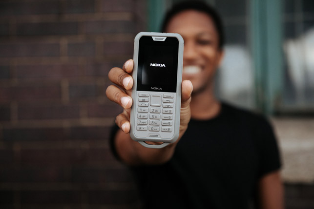
HMD Global has evolved the design of Nokia phones, without losing its original Finnish design ethos
Much has changed in the world since Nokia’s heyday almost two decades ago, but the lilting jingle of one of its mobile phones starting up remains much the same.
The sound of that tonal progression frequently punctuates our interview at the company’s global design headquarters in Paddington, London, as new models from its current range are brought in and laid out on a table.
HMD Global’s design team is repeatedly described as “nimble” by Raun Forsyth, head of design for HMD Global, the home of Nokia phones. He’s the driving force behind the current models, and is striving to restore the brand to the top echelons, both in addressing its core market and in product design.
It’s early days yet in what is Nokia phones’ third act. Previous deals saw the mobile devices arm of the original Finnish company bought by Microsoft in September 2013, and then by HMD Global in May 2016. Despite the turbulence, you sense that, in its latest guise, the brand is finding its place in the world again.
That world looks a little different. For starters, compared to Nokia’s peak, there are now many more mobile phone users around the world, whose demands vary wildly. Some trends have allowed for parallel innovation to take place: in fast-developing markets, robust build quality and battery life are expected from what is an expensive purchase relative to average incomes; elsewhere, the call for longer lasting handsets is growing as consumers subscribe to phone contracts that last over 24 months.
Nokia phones use Google’s Android operating system that, with its promised lack of bloatware and regular upgrades, means handset lifespan can be lengthened, with most consumers hanging on to their phones for an average of 2.7 years.
While it still produces glossy, glass-fronted smartphones, two of Nokia’s latest, more basic ‘feature phone’ designs embrace the demands of a wider global market.
The design of the Nokia 2720 Flip, for example, directly targets a demographic that wants chunky, easy-read buttons, singlehanded use and a folding polycarbonate clamshell to protect the screen. As cumbersome as this may sound in an era of slick phones made from slithers of glass and metal, the phone’s form is highly considered, minimal in its detail and Braunesque in its functionality.
The Nokia 800 Tough, meanwhile, is incredibly resilient to drops, dust and liquids and, with a 43-day battery standby time, is ideal for those living and working in harsh and/or remote environments, but equally useful as a second phone for people heading out on camping weekends.
Meanwhile, younger consumers in countries like India are still able to surprise research groups with their expectations. While the Nokia 800 Tough is ruggedly designed and put together, it still gives its owners access to the major social media platforms, 4G connectivity and Google Assistant voice control.
Aesthetic tastes also differ: while black and silver materials might dominate western tastes, in India, there is a universal love for colours like deep royal blue.
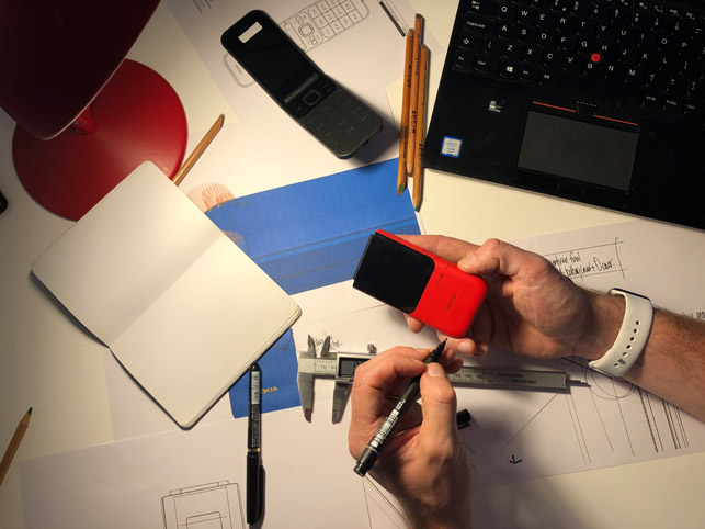
3D-printed prototypes allow the team to quickly go through iterations of a design that can then be evolved
Nokia – from trends to products
Translating these trends into products begins with a team of six designers based at HMD Global’s design headquarters. A further four designers are spread between Beijing and Taipei.
It’s in London that every design brief begins, bringing together global and regional trends, marketing feedback and financial assessments.
With its mix of ‘Old Nokians’, responsible for some of the brand’s most classic designs, and an influx of new blood, the team boasts over 75 years of combined experience of the Nokia way of doing things, both yesterday and today.
“It might be challenging at first, but this is our heritage,” says Forsyth of the design process brought along from the brand’s previous iterations. “Experimental and user-driven design can actually bring huge value to the brand and give us leadership.”
Memories of Nokia’s 3310 conjure up images of bright coloured plastics, sweeping lines and soft edges, yet the brand has its roots in minimalist Finnish design – such as Alvar Aalto’s famous mid-century design for the Savoy vase.
There’s a sense of emotion being added into the forms of products shaped by industrial processes.
“When you simplify things, that simplification not only brings a bold, clear design, it also brings reliability and the kind of seamless, clean look, that actually, by its nature, becomes beautiful,” says Forsyth, admiring an image of Aalto’s vase.
“I think minimalism is sometimes misunderstood as being kind of something else, but actually it is about this efficiency and reliability. Essential things are there; there’s nothing arbitrary or ‘designer’; an engineer hasn’t forced his own or thoughts or opinions on it. It is kind of its bare bones.”
Forsyth believes that the mobile device industry is still very much in its infancy but evolving fast, to a place where he can easily imagine phones one day being worn as jewellery, or even contained in-ear. “We’re only just starting on how we understand phones to be,” he says, before returning to the handsets laid out in front of him. “Now, we’re still tied to this ‘piece of glass’ frame.”
The brand’s current range-leading smartphone is the Nokia 9 PureView, built with five Zeiss-lensed cameras that shoot in the RAW-derived DNG format, and resplendent in the midnight blue colour beloved by the youth of Mumbai.
At nearly half the price of the market’s major top models, Forsyth describes the 9 as a “value flagship”, one that’s not aiming to beat every device on the market on every specification.
“We were going after the purest photographer. Can you get a professional image just by hitting shoot? And from all the accounts, we did,” he says.
Compared to rival handsets, it is noticeable how the camera and sensor array on its rear sits flush with the surface of the handset, a fight Nokia’s designers battled hard to win with its engineers.
“One piece, without a camera bump. It seemed like a little bit of a dream!” the head designer laughs, holding up the phone. “Those tiny little wins make a lot of difference. So, when I see it now, I’m kind of amazed that we managed it.”
He explains that the smooth back was an attempt to downplay the camera’s capability as much as possible. Even though the lenses remain as cut-throughs, they are subtle, and don’t scream about its technical prowess.
In models where technical specs may fall short of some rivals, Nokia’s design team have worked hard to create a physical product that looks and feels much greater than the sum of its parts. For one model, for example, the planned budget would not stretch to wrap-around, edge-to-edge glass, but Nokia’s research showed that the target market still wanted a slim, beautiful device.
The design team set about working on a polished bezel around the glass, which made it wider than normal, allowing them to taper and shape and surface, to give a much thinner edge, essentially faking a glass edge rollover.
In focus group testing, it was a success. “They just assumed that it’s going to be really expensive. But of course, the [extra] $2 for that kind of machined piece of glass is kind of what [the design team] is about,” he says. “[We have] this idea of everyone, even if they don’t have any money at all, they still deserve something stunning.”
The picture that Forsyth and his team paint is one of constantly striving to maintain the ethos of Nokia, and its principles, in the face of a much more crowded market – one that puts more burden on cost per part, which impacts engineering decisions.
“You almost have to chase, and [have] the passion. I fight for every single thing. That’s the difference between winning and losing – a really, really fine line,” he says. “It’s a nuance here, a little bit of surface treatment, a little bit of detailing. It might seem like, ‘Ah, it doesn’t matter, just do a simple bezel’, but that’s what the game is.”
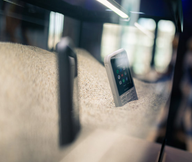
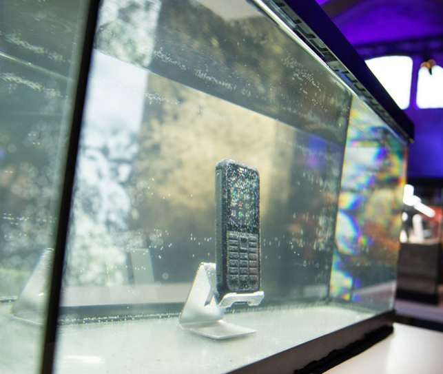
The Nokia 800 Tough, as its name and ruggedised case suggest, has been designed with for outdoor explorers and harsh work environments

The flip phone is back, with the Nokia 2720 targeting customers who want easy-read buttons, single-handed use, and a more protective case
Nokia – brief challenges
The initial brief for a new phone is instantly questioned by designers in a roundtable session, in order to establish what consumers at a particular price point really want.
Challenging a brief is one thing, but anything that impacts the budget has knock-on effects on fundamentals, such as what material the handset will be made from.
It’s at this point that Nokia phones’ experience of designing for various manufacturing processes and materials becomes clear, with the team able to ensure an end product that ticks the right boxes. The workflow is all about fast iterations, finessing tiny details and knowing the build processes inside out.
Forms penned on whiteboards during the initial briefing are worked up “quick and sketchy” into 3D using Autodesk Alias and Rhino 3D. When Forsyth stresses the nimble nature of design at HMD Global, he’s not joking. Surface models are immediately brought to life with materials and colour through KeyShot 3D visualisations.
“When you’re looking at it on the screen, there are no surprises. You brought the CAD in, you’ve rendered it in the materials, you’re seeing it at scale.”
He’s adamant that the quality of these designs comes from the team’s expert ability to model surfaces in 3D. “If we do a sketch and give it to just a CAD jockey who’s not really sensitive, the design doesn’t somehow pull you in,” he says. “Whereas, when [our team] manipulate the surface, and tune and play with it, all of a sudden, the surface has just changed a tiny bit and it’s awesome!”
It just feels natural, he says, “almost like pebbles on a beach. And I think it’s that skill set that we’re really keen to hold on to.”
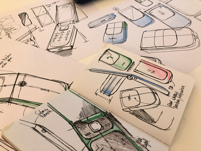
The design process begins with sketches not only on paper, but also in digital format
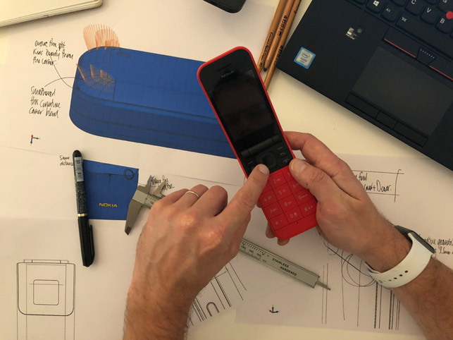
Using 3D printed models allows the Class A surfaces to be finessed even further
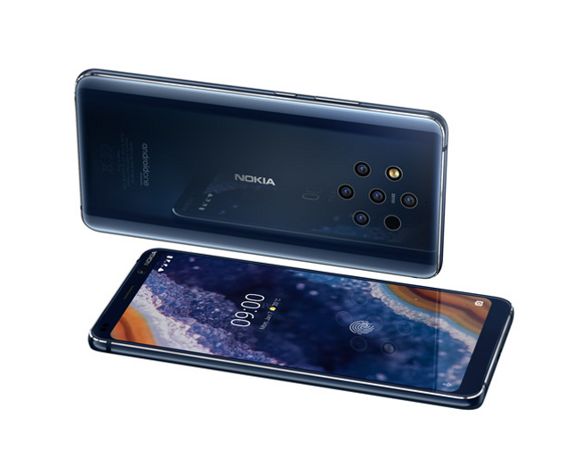
Flagship model the Nokia 9 PureView features five cameras to help photographers get the best shot, yet designers still managed to give it an understated, fully flush phone back
Breathless pace
The breathless pace continues into first-stage prototypes: high-detail, 3D-printed models are produced overnight on an in-house Stratasys Connex 500, ready for assessment the next morning. Having physical models allows for the surface design to be tweaked early on, with iterations being trialled and amended in multiple batches.
“It’s really quick [and] can happen in a week. And then straight away, we’re sharing as much as we can, because the engineers will do their own prototyping,” says Forsyth.
“With the CAD and visualisation tools, we don’t really get any kind of surprises.”
Two of the design team then translate the A-surface designs into Catia, ready for the engineers to import and begin working on the ‘bones’ inside – still under the strict guidance of the design team.
Analysis tools within Catia and other software systems allow the engineers to simulate how a phone behaves, allowing data to be sent back and forward to the designers, letting them adjust the design to benefit signal strength and component positioning, massively speeding up the process. Prototypes from this point tend to be CNC-machined, so careful avoidance of any major redevelopment of the phone beyond this point helps to sidestep delays in getting it to market.
Forsyth is a strong believer in the role that physical prototyping plays, not only in benefiting the design process, but also helping to make faster, better business decisions.
He explains that, in order to get ahead in the mobile devices market in the future, more experimentation will be needed, and that most often, the people making decisions won’t really know what’s possible “unless they experience it.”
Nokia already produces dummy units to help gauge opinions, running the most basic of image-based user interfaces in low-volume production handsets, just to see how people interact with what they’re holding.
Given an unlimited budget, Forsyth says he would happily use more 3D printing to bring products to life earlier in the design process. “Engineering is expensive, so if you were to invest in a whole production line, and then a year down the line, think that the market’s changed or we don’t have an appetite for this particular product, then they close a factory – you’re talking hundreds of millions of quid,” he reasons.
“Whereas, what we’re talking about is £100,000 [for prototyping], and the people who need to make the decision – leadership, CEOs and heads of product, they can actually get a really clear sense of how this is actually the experience you’re after.”
While mobile phones have changed the world around us, the growing size of the market and new demands and technologies mean that design is likely to evolve at an even faster pace in future. Through its global reach and design agility, HMD Global and its familiar start-up tone are still capable of making a big noise.

