At New York-based design consultancy Pensa, narrative is what drives communication. The firm’s online portfolio showcases its newest designs not just as static objects, but as solutions in real-life settings.
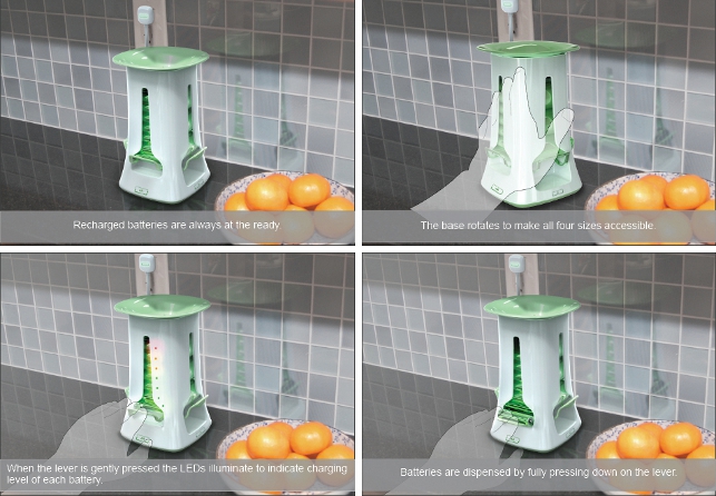
A visualisation explaining a concept Pensa created for a more convenient household battery charger
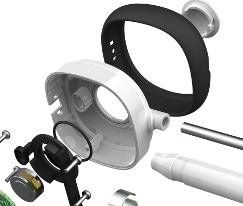
Storyboards show the instructions for use; annotated diagrams reveal the moving parts and different configurations. This kind of graphic description is not new, but the quality of it is.
The recent leap forward in visualisation technology has made highly realistic design imagery easier, faster and cheaper to generate. “It takes dramatically less staff time to produce renderings,” comments Marco Perry, principal and co-founder of Pensa.
“We now have higher quality presentations and ultimately, we’re producing more images.” More images are giving firms like Pensa far greater latitude in explaining how consumer products will look, how they will be made, and how they will work.
Designers can easily show in visuals what used to remain in the abstract. “The reality is we are not always trying to get to the ultimate possible rendition of something,” adds Perry. “Many times we just need a good picture that explains what we want to do in one particular aspect.”
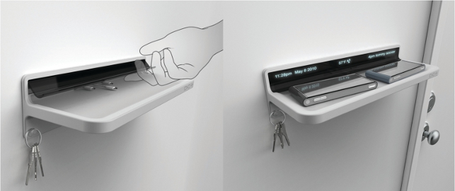
A rendering of a DC+ powered charging shelf for mobile phones
The explanatory power leads to quicker and smarter decisions, and not just among the design team. Many of Pensa’s clients – which include Pepsi, Samsung, OXO, Pfizer and Playtex – are beginning to circulate early design images internally.
“Stakeholders are definitely making decisions based on these visuals, from the engineering and marketing departments, sometimes sales, all the way up the executive ladder on the client’s side,” he says.
Past and present
Until only a few years ago, rendering a 3D model to look like a real product took a painstaking amount of work, a task only a few on a design team could do well.
“Rendering in the past required you to have the skills of both a photographer and a computer expert,” explains Perry. “Like a photographer, you had to understand the physics of lighting to get the right angle, shadow, and reflectivity. Then you had to be a computer expert because you had to translate this understanding into numbers.
You had to know what levers to pull and push inside the program to get the effects.” New advances in software have eliminated this need for specialised expertise. Common materials like soft plastic or brushed aluminium are pre-programmed to reflect light naturally.
Designers simply drag them from palettes and drop them onto a surface of a model, like a game of 3D paint-by-numbers. Rendering experts used to slave over the subtle shadows that give objects the right illusion of depth. Now the shading appears perfectly on every render.
Pensa uses KeyShot, developed by the software firm Luxion, to create its renderings. Besides simplifying the work of making convincingly real product shots, KeyShot also does it all much faster than programs in the past, in a matter of seconds as opposed to hours.
“The processing time used to be a limiting factor because if it took four hours per piece, then forget it. To show 16 to 20 concepts or multiple views would take forever,” says Perry. “With an application like KeyShot, you literally just drop it in, take a snapshot, change the view and then grab another one. It makes rendering a non-event.”
People who are not at all versed in optics can now turn a CAD model into several studio-quality images in the span of an hour. In fact, Pensa’s engineers who typically deal in bare 3D schematics can jump on KeyShot and produce impressive screenshots within a few minutes.
“Because it’s super fast and super easy, it removes the bottleneck that comes from having one particular staff member who is an expert at rendering, lighting schemes and all those kind of settings. KeyShot levelled the playing field, so anybody in the office can just drop an object in there and take a shot,” comments Perry.
Placing products in context
According to Perry, the core purpose of rendering for designers is the same as it has been in years past. “We can view CAD data as realistically as possible before getting prototypes of it. In some cases, when we work on very largescale equipment like vending machines, to get a prototype is no small feat. We need to evaluate the product before it gets that far in the process.”
Beyond virtual prototypes and client presentations, other uses for design imagery are fast emerging outside the design cycle. Product shots are popping up more and more on operation instructions, and assembly directions, marketing catalogues and advertising. Because renderings can incorporate photographic backgrounds and other virtual household objects in the same lighting scheme, Pensa can use them to illustrate whole scenarios.
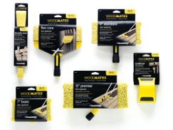
When some wood-staining accessories destined for Lowe’s hardware stores were not off the manufacturing line in time for a photo shoot, the task to illustrate the packaging fell back to Pensa. The team made KeyShot images of the sponge applicator and also its context – and simulated the stripe of stain running down a virtual backyard fence.
The graphic is cheaper and faster to produce than studio photography and because of its conceptual simplification, arguably more visually communicative than a real photograph. Earlier this year, the line of packaging designs won three marketing awards from the North American Retail Hardware Association (NHRA).
The impact of images
Perry senses that because the changes in technology are still relatively new, the profession will continue to feel their effects. As more clients come to expect realistic explanations of product concepts, they’re simply going to want more of them.
“At an early stage, it gives you a leg up on the competition, but I know our competitors are starting to use the same software, so you have to keep up with everybody as well,” he says. “Eventually, a nice realistic image becomes a cost of entry. If you’re not doing it, you don’t appear as if you are producing the same level of quality.” 
Keyshot brings products to life for design consultancy Pensa
Default


