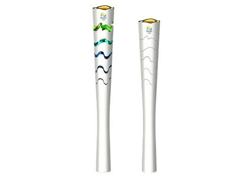
With Rio 2016 just around the corner, the new Olympic Torch has been unveiled – with moving coloured segments
It seems like only yesterday we made a fanfare of London 2012’s BarberOsgerby crafted Olympic Torch, but it’s shocking to realise that Rio’s turn to host the event is quickly upon us – and its torch is ready to light up.
Designed by Sao Paolo-based design studio Chelles & Hayashi, the torch features an expanding, segmented body that reveals the colours of the host nation’s sky, mountains, sea and earth when passed between torchbearers.
The multi-disciplinary studio, headed up by Gustavo Chelles and Romy Hayshi, has a huge mixed portfolio of product and packaging designs, and seem to create at least part of their 3D output in SolidWorks.
https://youtube.com/watch?v=6mUhCoXakQs%3Frel%3D0
Built from recycled aluminum and resin, the winning design will be passed around Brazil in the lead up to next August’s games.
The torches of recent years have become synonymous with the host country’s design skills, but also with unexpected faults (the torch for the Sochi Winter Olympics blew out a total of 44 times during its procession) – so time will tell if those moving parts were a good idea or not.
Below you can watch a montage of the torch design’s inspiration – which sets the mood nicely for the 2016 Olympic Games.
Blazing a trail

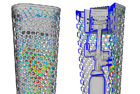
UK firm TECOSIM relied heavily on CAE in the development of the 2012 Olympic torch
Standing 800mm tall and perforated with 8,000 small holes, the golden London 2012 Olympic Torch became a powerful symbol in its short life.


