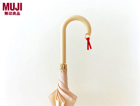
A simple hole allows this umbrella to be personalised, increasing personal attachment and lowering its likelihood of becoming a ‘disposable’ product
Last night we were lucky enough to squeeze into London’s fine Design Museum to witness the opening of its latest exhibition: Muji Presents Product Fitness 80 and the accompanying talk.
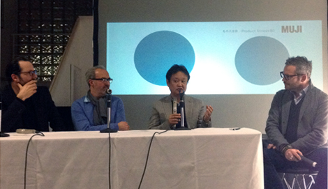
Three of the Japanese company’s most famous contributing designers took to the stage: Naoto Fukasawa, Sam Hecht and Konstantin Grcic talked about the challenges of designing for Muji, its ethos, and how the aftermath of last year’s Japanese earthquake had prompted a rethink in product design, and subsequently, this exhibition.
As a company known for its ‘pursuit of adequacy’ and products fit for purpose, it was interesting to see how designing for the aftermath of a natural disaster helped tighten the functionality of items further. Hence Product fitness 80 – products designed with 20 per cent less than current design – better for a joyful, balanced and healthy life.

[From L-R] Konstantin Grcic, Sam Hecht, Naoto Fukasawa and chair Tyler Brûlé
“Having not quite enough is actually just about right… 80 per cent is the right amount… for a healthy state of mind,” said Fukasawa, trying to explain an old common sense Japanese saying that they turned to: ‘Eat in measure and defy the doctor’ (or stopping eating before you’re stuffed is healthier).
Looking at Japanese life and seeing the waste of all Tokyo’s bright neon, the six million discard bento boxes and over elaborated design that added extra burden to the crisis – the Japanese people began to cut back immediately, and Muji took great inspiration from this.
Simplistic designs resulted: socks made from leftover thread; a single pan lid designed to fit five different size pans, and Grcic’s umbrella that, through a small hole drilled into it’s handle, allowed it to be personalised with a charm or ribbon – making the owner care more and have a relationship with the product, and lessening the ‘disposable’ nature of it.
“It’s little gestures that create a product,” explained Grcic. “It’s making things simpler, in terms of even more close to us, [making them] even more valuable.”
Seeking out design is what Muji is also known for. Naoto Fukasawa gave brilliant examples of organic design that has evolved over time, with China being an example of how design has been tweaked for function over countless years by everyday people – Fukasawa’s favourite example being a pair of work gloves made from scraps of material.
Great design, we were reminded, is all around us. Although we might pass it off as cheap or tacky, it’s even among the type of items sold by street vendors or pound stores.
A garish child’s stool, mass produced in China, embellished with a dancing panda is a grotesque object – but stripped to a neutral state, its functional beauty is one that has been around for decades.
The same applies for an everyday hand fan, produced in their millions and decorated with overstated present-day Chinese bombast – reducing them to neutral forms they are functionally perfect.
Removing the 20 per cent that we don’t need is strikingly obvious when you think about it, with the exhibition helping us reassess what sustainable design can mean.
Muji Presents Product Fitness 80 runs from 9 – 18 March, 2012 at the Design Museum, London.


