
Rendering is something that many designers and engineers are adopting. The benefits are pretty well established, if you can show your non-technical peers an image that represents a concept, a future product in a photo realistic manner, so that there’s no need for interpretation, then they get a better understanding.
Decisions become easier as everyone has the same basis for their thoughts and you have a real feel for those things will look. While aesthetic quality isn’t paramount in many products, but the facts are that a photorealistic rendering speaks volumes for even the most seemingly mundane product.
But alongside these benefits, the rendering process can take some learning. Almost every 3D design tool includes rendering tools and technologies, there is always a learning curve. Yes, things have become much easier with the introduction of tools such as KeyShot/HyperShot/Shot, PhotoView 360 and the like, there’s still a couple of key things to consider. So, my plan is cover a few of things over the next few months and see where we get to, assist you getting the best out of the process. After all, rendering is often a side issue for those using the tools and technology in the context of mainstream engineering and design – its another thing to squeeze in.
So, the subject for today’s post is settings and specifically, what to consider when you’re setting up your rendering jobs. Most rendering tools use a ray tracing process. If you want the technicalities of ray tracing, there’s a whole load of resources on the web, but it can be distilled down to this:
Ray tracing is a technique for generating an image by tracing the path of light through pixels in an image plane and simulating the effects of its encounters with virtual objects. (source: wikipedia.com)
AdvertisementAdvertisement
Essentially, this is the reverse of what happens in the physical world. Light sources (the sun, lightbulbs etc) pass ‘rays of light outward, they either go directly to your eye or bounce off or through other objects – reflection and refraction – they often split and then move on to bounce off other objects. As each “bounce” occurs, the appearance that light changes, in strength and in colour. Looking at the world around you and you’ll see that light is rarely the same as it’s source, it’s been reflected and refracted off or through objects, through the atmosphere even, splits and eventually ends up in your eye.
It’s the bouncing and passing through of light is the key thing to understand when it comes to ray tracing. To achieve photorealism, you need to ensure that the rays in your rendering scene bounce enough times to create realistic lighting conditions and subsequently, realistic images. This bouncing of light, when combined with materials and geometry, is what gives you the images you see. Of course, this needs to calculated and that my friends, is the hard bit. While the software algorithms take care of the hard work, it’s a complex and time consuming process. Yes, things have got more efficient with multi-core workstations, but to create a final render can often take time – a lot of time.
The trick is to ensure that you have your rendering tool set-up to give you the results you want, to the quality you want, without over complicating things. and a lot of that boils down to how many ray bounces you allow your system to use. Use too few and you get a quick result, but you also get a crap image. Use too many and you end up with a fantastic image, but one which takes from now till doomsday to calculate.
How do you find the happy medium? Here’s an example. We have a scene and we’re looking to render out a 720p HD size image at 72dpi. Light is taken from one area light as well as from the surrounding HDR image. Without any ray bounces, you would end up with this.
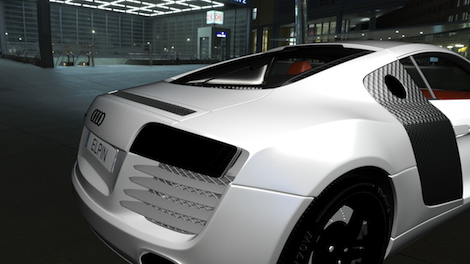
The image is ok. It looks like a CAD generated image. While there’s lighting in the scene, the materials are dull and flat. There’s no shadows and the reflective materials (look at the rims, the light cluster and fuel cap in particular) are black.
Why is this?
Reflective materials get their appearance from light bouncing off them, creating highlights and reflections. Stop light bouncing and the material essentially has no visual quality. The same is true of shadows. Shadows are essentially a lack of light – if you don’t bounce the light, you don’t get shadows.
The interesting one in this context is the paint job. Automotive paint is a multi-layered material. Colour, metallic particle content, topped off with highly polished lacquer – but to get that effect, you need light to interact with it. All in all, this is a crappy image. but it renders quickly.
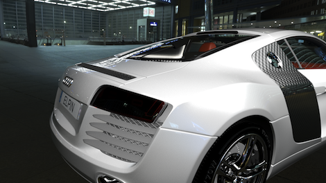
Now. same scene, but with one bounce of light – the light is emitted from the source (the area light and the HDR). Note that the reflections have appeared in the paint work. The highly reflective materials on the rims, fuel cap and logo on the back of the trunk have started to show up. But the light cluster is still dark and there’s precious little shadow.
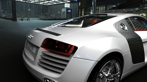
For this image, I turned up the controls to carry out 3 bounces of light. You’ll see that there’s now a much better representation of the light cluster, the reflective components and finally shadows are introduced. This is a much more pleasing image and one that could pass for photorealism. Still there are a few issues. The light cluster doesn’t look right, the headrest inside the car looks odd. Let’s crank it up to 8 way.
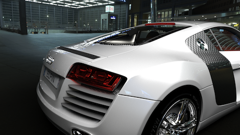
With 8 bounces you see that the paint job is the same as in the last couple of images, but you have a much more pleasing look. The shadows are more accurate, the interior of the car looks good, details such as the high-level brake cluster show up – a truly decent image.
To show you what happens when you really do ‘Go For It’ here’s the final image, with 15 ray bounces. The image is not that different from the 8 bounce image. Yes, there’s a bit more detail in the light cluster, but that’s about it.

Now. All very interesting I’m sure, but the key thing for me is the render times involved. Look at the chart below.
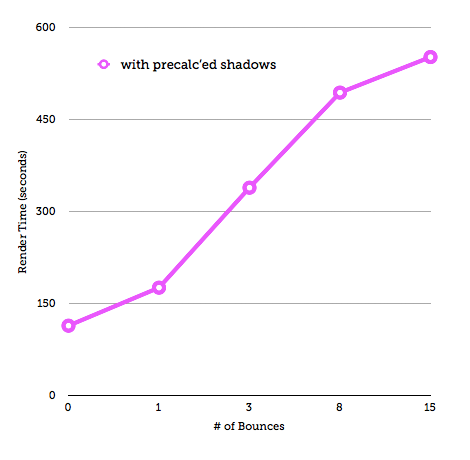
This shows the render times for each of these images. What it also shows is that the render times stack up as you increase the number of bounces. It can go from calculating in seconds to minutes to potentially hours. That’s for a static image with very standard lighting conditions.
As you’ll have seen, the results don’t make a huge amount of difference as you get past a number of bounces.
This is the challenge.
You need to look at your scene or product model and the materials you’re using. If you’re using transparent and/or highly reflective materials, they’ll require more bounces to achieve realism. If you don’t have them, you can probably use ‘lower’ settings and get results more quickly.
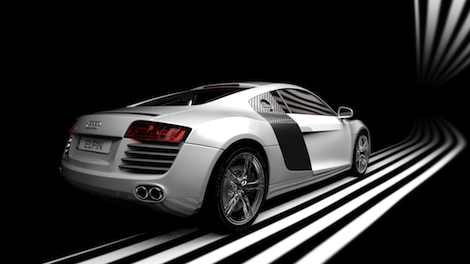
Here’s a final render – the settings were wound down to an appropriate level and the render got done in an appropriate time, to the appropriate quality – which is the name of the game.
A caveat: This is pertains mostly to raytracers, but there are a large number of rendering tools available at present and more coming online. Some are openly ray tracing tools, others introduce other technologies such as Global Illumination or Photon Mapping. You’ll usually find that some systems combine the two. KeyShot (formerly HyperShot) is described as photon mapping software, but when the chips are down, the same rules apply, wind down the settings if you don’t need them and get your results more quickly.
If you want to learn more, then I’d highly recommend a book by an old mate of DEVELOP3D’s and an old mentor, Darren Brooker, who’s Essential CG lighting Techniques – it’s a good source of learning for all this stuff.
Tomorrow I’ll post some details of how you adjust these settings in some of the main 3D design tools so you can see it for yourself.


