It makes me happy
Fans of the three S’s of Tequila: sipping, shooting and slamming, for the first time we’ve a clear view of the bottle from which this marvellous liquor comes.

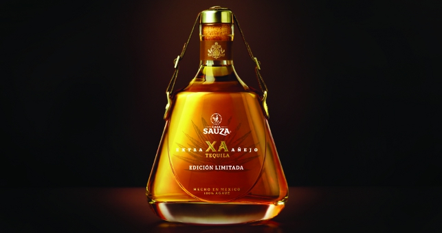
Structural packaging design consultants Studio Davis and brand and packaging design consultants Osborne Pike have collaborated to create this distinctive bottle design for Casa Sauza XA tequila.
The objective of the design was to embody the core values of Casa Sauza XA, which centres around heritage and craftsmanship.
Taking inspiration from La Quinta, the spiritual home of the Sauza family, Don Cenobio Sauza, the founder of the distillery and refined, limited edition tequilas, a hypothetical design target was created, known as the ‘Urban Gentleman’.
The key features of this Edicion Limitada bottle include the distinctive leather strap and metal buckles, reminiscent of decorative Mexican saddles.
The ‘distressed’ leather strap combines with a metal stopper to define what the branding team describe as the opening and closing ritual of an ultra-premium spirit – part of a distinctive ‘sensory’ brand asset.
Sketching a number of initial designs to capture the feel of the concept ideas, the leading designs were 3D modelled in Rhino 3D and then into handmade white foam models, allowing for more accurate geometry.
“We like to adopt a hands on approach, not relying solely on CAD,” explains Jen Jones of Studio Davis. “By working quickly and fluidly between CAD, white foam models and sketches we stay close to the physical form.”
Design cues such as the exaggerated, heavy glass base of the bottle accentuate the quality of this ultra-premium product, as does the paper neck label featuring the Sauza coat of arms printed in foil-blocking.
Only simple draft angle analysis and volumetrics were used in house, with the team working closely with production suppliers to finalise requirements for the manufacturing capability.
Aside from the foam models, acrylic models were CNC machined from solid acrylic and polished up to look similar to the real thing and helping stakeholders visualise the final product.
Incorporating a hidden label panel and a traditional, non-engineered looking form, even around challenging mouldable geometry, formed the key challenges.
For the drinker, knowing whether to drink it or stare admiringly might prove a different challenge altogether.
Piggy-back pharmacy
Getting necessary medicines to remote parts of the world is a struggle for many aid agencies, but ColaLife is finding a way past this.

You can buy a Coca-Cola almost anywhere in the world, including most developing countries, yet in these same places one in every seven children die before their fifth birthday from preventable causes, mostly as a result of dehydration from diarrhoea.
With a lack of progress over the last 30 years, ColaLife and its partners have arrived at using Cola delivery as a means of getting aid to these communities.
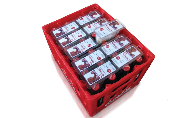
The structural packaging team at London-based design consultancy Pi Global 3 created a patented wedge shaped, vacuum formed container made of rPET (80 per cent recycled PET) to fit amongst the rows of Coca-Cola bottles.
A consortium was formed between Charpack (manufacturing of the container and lid), Amcor Flexibles (transparent film to seal the AidPod), Packaging Automation Limited (the machinery that heat seals the film to the AidPod) and Saunders & Dolleymore LLP (advice on Intellectual Property) to ensure that ColaLife had the best team to support it.
However, the AidPod’s benefits go beyond a robust transportation container as all branding and instructions are in a leaflet slotted into the lid. This means that the plastic remains clear thus rendering it potentially suitable for SODIS (solar water disinfection).
It can be used as a measuring jug so that the oral rehydration salts are mixed directly into it ensuring the measurements are correct. Users can make up an individual required dose rather than a minimum of one litre of bulk fluid.
The lid prevents contamination and allows the mixture to be fully dissolved via shaking whilst also used as a cup.
The packaging then piggy-backs on the ‘last mile’ of the distribution, taking up unused space within the crates.
Greener on the other side
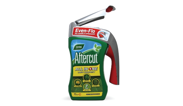
Containers can be so much more than mere storage vessels; take the Westland’s Even-Flo lawn care system.

Designers Webb deVlam devised an inter-changeable handle with an integrated spreading chute that latches onto the lightweight canister and then flips open to deliver a smooth and even flow of granules onto the lawn.
It employs a dispersing ball device within the nozzle to achieve the perfect even spread of product.
The handle is detachable, so that it can be used with any of the series of lawn care products; when empty it is simply replaced with any of the recyclable refill packs.
“I can remember the wall of Post-it notes at the beginning of this project, each thumbnail sketch holding a potential answer to a particular aspect of the problem before us,” laughs Webb deVlam’s senior structural designer Mark Armstrong, recalling the blistering pace with which the project was tackled.
“Once a concept was chosen we again broke it down so that we could quickly develop two aspects of it in parallel. One team was tasked with the practical and mechanical aspects, the other concentrated on the brand and aesthetic delivery.”
Both aspects were then combined taking the ideas into CAD to develop them into a working prototype. “From here we were able to validate the idea and start to fi ne-tune the delivery system,” states Armstrong.
“Photoshop, Keynote and Keyshot were used for the preparation of various project presentations. The presentations themselves were not just used as a simple record of ideas and processes but were used to focus thought and as an aid to debate and decision.
“Solidworks was used for CAD, not just for the final development of the pack, but as a design tool to create ‘realistic skeletons’ that could be printed out and sketched over to develop the aesthetics.”
Manufacturers were introduced to the concept so that potential problems could be designed out at an early stage, while the 3D CAD was progressed to a handover stage for manufacture.
A look at some of the latest innovations in packaging design
Default


