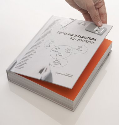
I don’t really want this to turn into a book review blog, but there have been some amazing publications in the last few years. One of my personal favourites is Designing Interaction by IDEO founder, Bill Moggridge.
For anyone involved in design, in product development, its chock full of interview and studies of how designers are adapting to accommodate how users interact with their products, be that by software, hardware – whatever.
One of my favourite chapters is an interview with Kenji Hatori, a software engineer at Canon who developed PhotoStitch.
It describes the stitch assist mode for cameras and Rikako recounts the process used to design the screen behaviours for the PhotoStitch software, with a clear structure indicated by tabs and actions clarified by animations.
The book is supplied with a DVD that’s worth sitting a watching (and yup, boring your families with) – a great deal can be learned. You can see a video of the interview here.
If we’re to develop truly stunning products, whatever field they are active in, then the whole user experience needs to be address – and its something that CAD vendors should take note of – more so now than every before.
The technology we use to develop products seems to be getting easier to handle, but without some form of forethought, some sort of rationalisation, its all for nothing. and again, the question of whether the Microsoft Ribbon UI is the way forward spring to mind.
We develop in 3D – should our tools follow the same UI characteristics as Word, Excel and Outlook.
Familiarity is the reason that vendors have jumped all over it, the argument being that if you can drive Word or Outlook, you can drive SolidWorks, SpaceClaim, Inventor et al.
I’m not convinced.


