Data-rich media can be a huge help in promoting better communication and comprehension in collaborative tasks. It’s time we used more imagination and ingenuity in the ways we put it to work, writes Erin McDermott
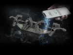
Earlier this year, before pandemic roadblocks made travelling difficult, I toured FoVI3D in Austin, Texas. The company is developing some absolutely mind-blowing technology to make 3D light field displays.
These screens generate three-dimensional images that change depending on your perspective. But FoVI3D is doing more than just adding optical illusions to make 2D things appear in 3D.
This tech actually displays different data as you move in relation to the screen, just as if you were looking at a real object in real life.
Thomas Burnett, president and chief technology officer of FoVI3D explained to me that, in critical situations, such as military events, having data-dense media like this yields proven advantages.
For example, if soldiers draw a scene with sticks and dirt in the ground, a lot gets missed in communication. “Hold up, was that rock the car or the tree?”
With a 2D aerial photo of a scene, by contrast, there’s less risk of misinterpretation. Then, if you go to a 3D map where you, yourself, can physically move around from the top of a building to a side view where you see individual levels, comprehension exponentially increases.
3D maps are even proven to speed up comprehension!
Remote teams
Today, as many of us struggle to work together in remote teams on physical products, I believe this lesson of data-rich media is directly relevant.
Recently, I saw this concept play out with instruction. I’m the corporate thesis advisor to a student who finished his mechanical engineering classwork in the early 2000s. At the time, he wasn’t able to get a corporate sponsor to complete his thesis, however, so he never technically graduated.
When I encouraged him to play around in Fusion 360, he expressed hesitation. He feared it would be too daunting to learn on his own, having been away from university for so long.
However, from needing to pick up several new software packages on the fly throughout my career, I knew a lot of learning challenges stem from the forms of instruction available.
That’s when a 3D modelling pro in my network, Adam James, serendipitously created a YouTube tutorial on Fusion 360 for beginners.
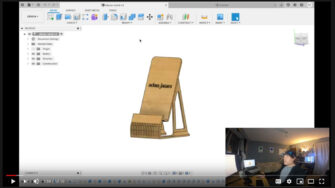
Unlike other tutorials, James doesn’t simply explain each feature separately in a monotone, disjointed lecture.
Instead, he takes the viewer step-by-step through modeling a real-life example: a phone stand.
After my co-op thesis student ran through the lesson, he seemed excited, instead of daunted.
Having this real-life example helped him grasp how each CAD function fit into the design process. Plus, he was stoked about being able to 3D print his work afterward.
High impact
In my own work, I didn’t realise how impactful data-dense media was until I communicated some basic optical engineering work with pictures.
Oftentimes, a widget is lit up in ways no one wants. This happens when some rays of light misbehave and go on a walkabout.
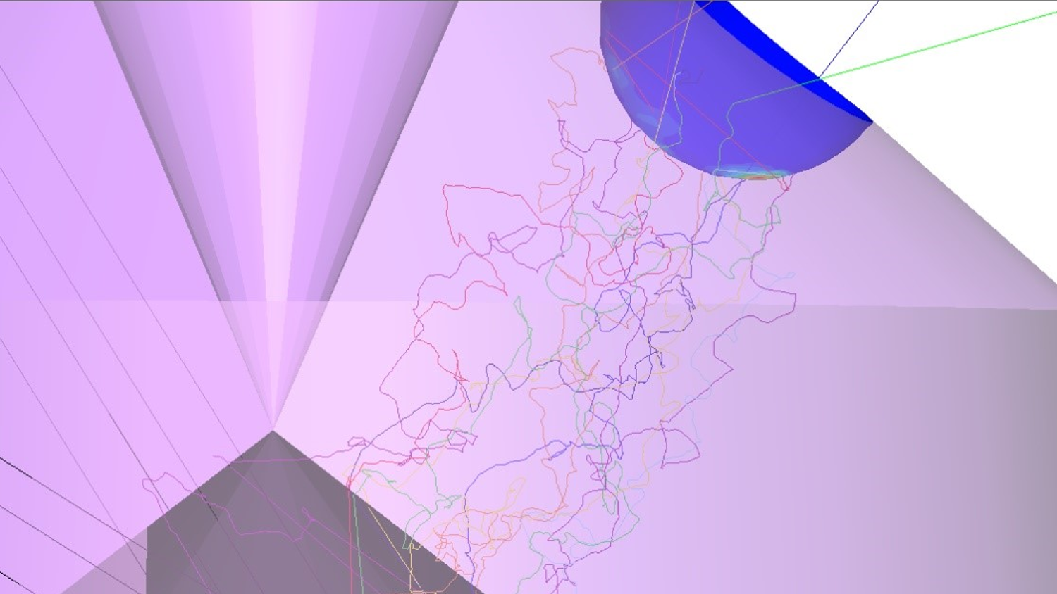
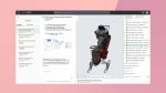
Above is a wildly ugly example in which three LEDs are placed inside the purple geometry and light shines outward.
The spherical cut-out at the top right, has a light receiver applied. Let’s pretend the client doesn’t want any light coming through that cut-out. There, the dark blue of the false colour plot means ‘no light’, and other colours mean light is hitting the surface.
Mostly, I’m checking out that false colour plot. However, when talking to a client who doesn’t speak my dialect of nerd, sometimes more literal depictions work better. That’s when I add in the colourful squiggles which are the exact light rays causing the problem. It’s like video footage of a crime being committed!
With this addition, other disciplines pull out much more understanding. Mechanical engineers can think about how to physically block those rays with added surfaces.
Electrical engineers can see how one LED contributes more to the problem and consider knocking down the power to that diode.
This type of analysis is also well worth the effort, because it is much simpler to produce than it was years ago with other software.
What about your communications? How many dimensions of data are you using?
Are there ways to make your lessons, reports and tough technical concepts more visual and more ‘real’ to make them easier to grasp?
Technology makes great advances all the time, so it’s good to check that your communications are keeping up!
Get in touch:
Erin M McDermott is director of optical engineering at Spire Starter and a digital nomad (read: vagrant).
She travels the world meeting hardware engineers who don’t know that things using light (cameras, LED illumination, LiDAR, lasers and so on) need competent design, optimisation and tolerancing like the rest of their widget.
Get in touch at spirestarter.com or @erinmmcdermott