This week is all about the iPad, Apple’s new device. I’ve only had a brief fiddle with one in the Apple Store here in Portland, where I’m visiting Autodesk to find out about the latest and greatest from Alias, Inventor, Moldflow and of course, have a look at SketchBook Pro, the company’s new offering for the iPad.
When Apple release a new product, there’s the usual complete and utter onslaught on coverage across the gamut of media – print, web, tv. The world, to be frank, goes ape-shit. When this company releases a new product, opinions are often formed long before the product ships and its often divisive. One of the more interesting things that happens is that an organisation called iFixit gets the hot product and strips it down to its component parts – something that is essential considering they make their cash from selling you components to fix these types of product. Being of a curious nature I took a look at the iPad stripdown – find it here – a fascinating look into the internals of a very neatly packaged product – the build quality is astounding, the display crystal clear and the interactivity is exceptional.
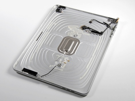
One thing leapt out at me when looking at the stage by stage breakdown was the aluminium rear cover. On the outside, it’s that classic Apple thing. Incredibly ‘simple’ looking forms that require a very high quality surface model to represent – and something I would imagine is fought over strongly during development to get it just right in terms of aesthetics as well as tactile response. But it wasn’t that which intrigued me. It was this shot of the inside:

Image courtesy of iFixit.com
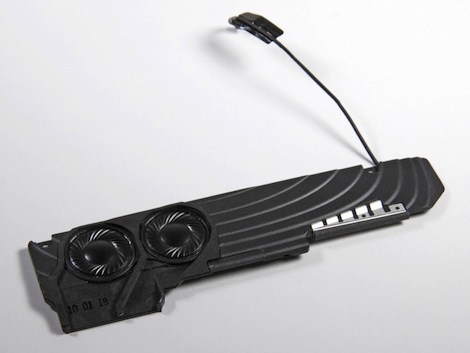
The internals of the rear cover are machined from a single billet of aluminium. While I’d imagine huge care is taken to get the exterior just right, the internals are clearly machined in a very short space of time. You can see the z-levels of the tool-paths used to create the part and it looks like it’s machined with speed in mind.But then you also notice that the plastic components have been designed to interface with that form also – as you’ll see from the shot of the speaker assembly below:

Now that’s impressive. What they appear to have done is removed time from the machining process, by removing traditional fixtures for these types of components and offset that against a slightly more complex tool for the plastic components. When you’re shifting serious units, the slight increase in cost of more complex tooling for these types of components is going to pale into insignificance compared to the potential savings when machining major components from aluminium in a dramatically shorter amount of time, of removing the need for additional fasteners being replaced with adhesives and well matched component forms and of course, a reduction in assembly steps.
Many people talk about Apple in hallowed terms, as the pinnacle of design-thinking, of innovation – there’s a trillion books on the subject and a factor of 10 more online articles. But often they concentrate on the aesthetic form of the product; namely, the exterior and there does seem to be something of a backlash against such posturing. But when you see this type of attention to detail, I’m led to believe that the real innovation and clear thinking is often found on the inside – to me, that’s design-doing and getting a job done and reducing complexity – and with that, there’s an inherent beauty that 99% of customers will never see.


