Your mobile phone has become an indispensable companion – it goes wherever you go and you never let it stray very far from your sight.

“In the Carbon Arte project we were looking at how to project success in a very modern way,” Daniel Gratiot, Nokia’s senior design manager for premium products
When you think about it, ten years ago hardly anyone had a mobile phone but today in the developed world everyone has one and in developing markets everyone wants one. It is arguably the product of our time and has become fundamental to how we live today.
Nokia is one of the biggest mobile phone manufacturers in the world. In fact, the statistics are quite startling – it manufactures more than 16 phones per second and 900 million people are in possession of one of its handsets. Nokia creates a wide range of devices targeted at diverse markets and individuals from the businessman who travels a great deal and needs a work tool with advanced email and Internet capabilities to gadgeteers who are after a pocket size multimedia.
Nokia strongly advocates that it is a design-led organisation. “Our responsibility as a design organisation is to bring technology alive in order to capture the imagination,” explains Alistair Curtis, Nokia’s chief designer. The global design team, consisting of over 300 designers of 34 different nationalities, is made up of diverse disciplines including graphic designers, service designers, industrial designers, material specialists and interaction and visual designers. The team operate out of four main design studios: Espoo in Finland, London, Beijing and Calabasas in California.
There are also design teams working in Copenhagen and at an additional three sites in Finland as well as the two recently opened satellite studios in Bangalore, India, and Rio, Brazil. This network allows Nokia to gather trends and inspiration from around the world and feed that information into new product designs. “As a design organisation we are physically and digitally managing and shaping the brand. At the end of the day we have to fulfil the Nokia brand promise of ‘beautiful to use’,” adds Curtis.
Although the design process itself may differ from phone to phone the driver is always people. “Everything we do starts with people. We are not designers in an ivory tower designing for ourselves – we listen to people and translate that into beautiful solutions,” says Curtis. “By observing people you see the way that they interact, the way they do things and the strange rituals they have. It’s understanding those things and being able to draw insights out of them in order to develop meaningful products.” Armed with this knowledge and understanding the designers can then make devices and services that best suit the user’s lifestyle.
Material gains
The designers as well as the consumer insights team are also constantly looking at new trends in architecture, design, colour and society. They also forecast trends that they expect will have a major impact on how mobile communications will be used in the future. One of these is emotional feedback – looking at how users will increasingly want their mobiles to be more personalised. The design teams are addressing this by looking at new ways to stimulate the senses through colours, textures, shape, fit in the hand, lighting and emotional appeal. “It’s a critical element as we move forward – clever use of materials and colours – and how you apply them to create a different and emotional relationship to products,” says Curtis.
Arte form
Materials, colour and texture are crucial to the very slick Nokia 8800 Arte range. Consisting of the Arte and Sapphire Arte, these phones reflect the growing trend for premium materials with each one being carefully crafted from quality materials such as leather and precious stones. They are aimed at those who appreciate the finer things in life and don’t mind splurging on a new mobile that oozes luxury and quality. “We started to work on the Arte products back in 2005. Our aim was to do a minimalist, elegant and timeless design,” says Grace Boicel, a senior design specialist at Nokia’s design studio in London, who is responsible for the selection and implementation of colours and materials.

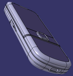
The Nokia 8800 Carbon Arte CAD surface model gives a sense of the seamless marriage of complex surfaces and refined details that blend to create the feel of a Nokia 8800 in the hand
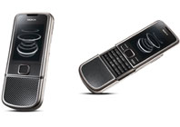
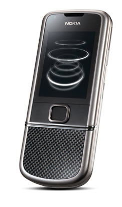
The most recent addition to the range is the Nokia 8800 Carbon Arte. As its name suggests, this latest offering has been constructed from carbon fibre as well as titanium, polished glass and stainless steel. In keeping with the tradition of the Arte range, each detail of the Carbon Arte is carefully considered to enhance the premium value and quality of the device such as the seamless surfaces, the smooth sliding mechanism, the weighty and solid feel, the anti-fingerprint coating, as well as the exclusive soundtrack composed by recognised producers Kruder & Dorfmeister and living wallpapers that transform throughout the day.
With this range the materials were essential and actually chosen before the device was even designed. “We planned in all the different material variants at the beginning of the first drawing of the 8800 Arte range,” says Boicel. However, there is a challenge in using such premium materials in the design of a mobile phone, especially carbon fibre with its weave and typical lack of consistency.
“Carbon fibre is used in so many places these days whether it’s innovative aircraft design, in the Virgin Galactic spacecraft or carbon fibre racing bikes seen in the Olympics recently,” says Daniel Gratiot, Nokia’s senior design manager for premium products. “Carbon fibre is applied for structural and weight reasons and is not therefore designed for aesthetics necessarily. So, for us the aesthetic of the carbon fibre was not the first priority – we were trying to capture those qualities and to do it in a consistent and crafted way. It has actually taken us over three years to develop the technique of manufacturing this with the quality and consistency that we wanted to achieve.”
Design inspiration
As with every design process at Nokia, this one also kicked off with user research. “What is important about the way we work at Nokia is that we start with people first. So, it’s very much about understanding who we are trying to design for. In our case, we are looking at people that are very successful and have the ability to afford the things they want and desire because they appreciate the quality and characteristics of these products,” says Gratiot. “In the Carbon Arte project we were looking at how to project success in a very modern way.”
Inspiration also came from a range of areas including architecture, sports car design and aerospace. Gratiot makes specific reference to the Guggenheim Museum Bilbao – a modern and contemporary art museum designed by Frank Gehry that combines curvaceous, titanium forms with limestone to create a sculptural feat of engineering. Gratiot explains that Gehry’s use of titanium was hugely inspiring in terms of innovation. “Zaha Hadid is also a very innovative architect as well as Herzog and de Meuron who use materials in really interesting and unusual ways. For us, in our premium products where material is so important to the quality and characteristics, it is important to find these kinds of inspiration to help push us to a new level,” he says.
Having created mood boards and conducted various workshops looking at colour, materials, forms and textures the designers started sketching ideas and then modelling them on the computer using 3D CAD software. According to Boicel, the designers make use of the industry standard tools and software. She, however, does explain that rapid prototyping is crucial and used extensively throughout the design and development process. “It’s important to do physical models to be able to totally understand how it feels in your hand and what it looks like when laid down on the table. I think that only when you have something in your hand do you know if it’s right or not,” says Boicel. “Rapid prototyping also helps to understand material finishing.”
Attention to detail
Many people from the design and engineering teams through to major stakeholders, material specialists, technology experts, vendors and manufacturers were involved in bringing the Carbon Arte to life. “When we talk about these products as being hand crafted I think people have this idea in their heads that you just stick the materials in one end of a factory, press a button and out the other end comes boxes with products,” says Gratiot. “But with premium products it’s really a very handcrafted process. There are, for example, over 90 people involved in just the assembly of a single product.”
But, for him, it’s the fitting together and assembly of the phone that is the crucial part. “There are many people in the process who are there just to look at the quality and consistency and make sure that every part fits as it’s specified and as it’s designed to,” he says.
The Carbon Arte has some very special design details including the use of a ball bearing mechanism to get the perfect open-and-close sliding action. Due to a unique ‘pop up’ feature, which uses a bi-stable spring and stainless steel ball bearings similar to those used in high-performance automobiles, the gliding action is elegant and seamless. The engineers also spent a lot of time on getting the distinct sound the phone makes when it opens and closes just right.
“We have a ball bearing mechanism that sounds great and feels great but it does that because that is what we as designers specified,” says Gratiot. “In terms of the quality, we wanted it to move in a very fluid motion, we wanted it to sound like a beautiful car door closing with a hermetic seal sound. So, we specified that and the engineers brought it to life. But ultimately it’s the craftsmanship of how it’s assembled that makes it real and these are individually tuned rails with ball bearings that have to communicate that vision ultimately.”
Other features include tap-for-time – tap the steel surface below the display twice and a clock appears on the screen and turn-to-mute – turn the phone facedown to mute incoming calls in a discrete manner. “All of these features come back to Nokia having a focus on making technology human and easy to use,” says Boicel.
The 3G phone also comes equipped with a multimedia player, a 3.2 mega pixel camera, an OLED panel with crisp graphics rendered in 16 million colours and built-in memory that has been expanded from previous offerings in the range to 4 GB. Additionally, Nokia’s anti-fingerprint coating reduces smudges on metal and glass and unsightly outer seams are hidden by an all-in-one microUSB connector. The phone is also delivered with a range of accessories including a Bluetooth touch-sensitive volume control headset, a desk stand and a stylish leather carrying case.
After three years of research and development Boicel is very happy with the final result. “This was a very enjoyable project to work on. I learnt a lot in terms of what you can and can’t do with the materials. It is also such a pleasure to work with such luxurious materials,” says Boicel, who goes on to explain that Nokia, with its exciting design community consisting of multidisciplinary teams all working together is a great company to work for. “Nokia has a respect for design. It pushes innovation to create beautiful products.” The Carbon Arte is a truly beautiful piece of design and with Christmas coming up you could treat yourself or a loved one but don’t expect much change from £1,000.
www.nokia.com
Nokia’s latest ‘designer’ phone is the work of their truly global design team


