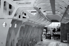
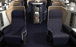
Five years in the making and a £100 million investment later, British Airways’ new first class cabin has taken to the skies.
It’s been ten years since the last redesign and far from being big and bold this latest re-launch offers a premium experience based on quality and attention to detail.
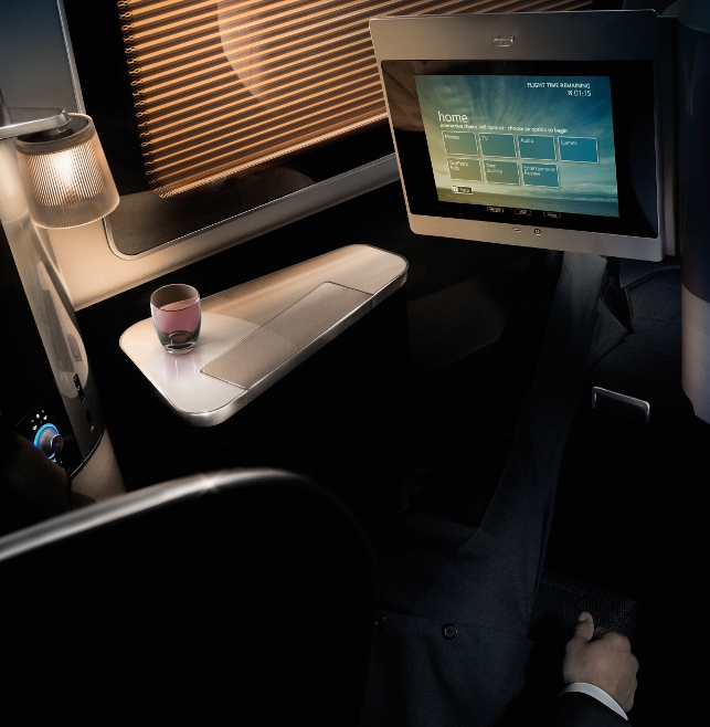
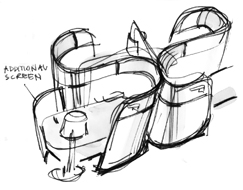
Optimising the distance of the passenger from the 15-inch touch screen on the seat in front was key challenge of the project
“The cabin builds on a rich heritage – I think it can best be described as understated British luxury and there are no gimmicks, you won’t find those at BA. It has really surpassed our expectations,” said BA’s chief executive officer, Willie Walsh, at the official launch of the 2010 First cabin, which was held recently at the exclusive Halcyon Gallery in London’s Mayfair.
Peter Cooke, BA’s design manager, realised a number of years back that with Concorde retiring and a new Club World product recently launched for business class travellers, the company had to now raise the bar for its first class passengers.
“It was about producing a new flagship product for BA,” explains Cooke. “However, it was not just about a seat that turns into a flat bed but also about the environment, the service and the soft product and then seaming all those together in a more total experience for the customer.”
Team building
In order to fulfil this task, BA called on two London-based design agencies. The lead agency would be Forpeople who, with its impressive legacy in the luxury travel sector having worked for Aston Martin and Jaguar, would be responsible for the overall look, feel and design of the cabin and suite, as well as all aspects of the service and branding elements. Meanwhile, product design consultancy Tangerine, having worked with BA on previous projects including the design of the patented Club World seat, would be responsible for spatial development and human factors.
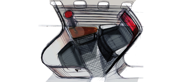
Creative pitch phase sketch concepts
Both agencies were given a separate brief of exploring the future of first class although at this time they didn’t know that they would potentially be brought together as a team. “The one sentence brief we had was ‘create a new flagship and reignite the spirit of Concorde’, which to anyone is the perfect brief but probably the most challenging too,” says Richard Stevens, managing creative director at Forpeople.
Meanwhile, Tangerine looked at how the first class cabin should be laid out in order to really optimise the space for each of the fourteen first class passengers. “We were given a brief to explore how could we deliver really significant improvements without ideally losing any seats or, if you had to lose seats, lose the absolute minimum, and could we deliver something better if we did,” recalls Martin Darbyshire, managing director of Tangerine.
Utilising its knowledge and previous experience of seat geometry and layout, the consultancy came up with two concepts. The eventual one chosen by BA kept the fourteen seats in a herringbone layout and, despite variants with regards to the seat positions, there were as many common parts as possible.
“As this was the preferred concept, we then had to work to develop an optimum solution to fit, which meant minimising the amounts of parts that change or ensuring that they can be changed easily if they are distinctive,” explains Darbyshire.
At this stage Tangerine and Forpeople were brought together and according to Cooke, it was a “great joining of minds” as each brought their own strengths and experiences to the project.
“Our remit was to work cooperatively with Forpeople building on their development of the overall customer experience and integrating our knowledge of seat design with formatting the aircraft and the delivery process,” comments Darbyshire. “So, we literally had to work glued together as a team to make it happen.”
The agencies also had to work as a team with the Working Group – a group made of representatives from every sector of BA’s business from cabin crew, purchasing, engineering, fleet, brand, marketing, design management and product development. As this project had to have ‘buy in’ from all of BA, there were weekly meetings held with this Working Group and they were also involved at each stage of the project’s development.
Back to basics
‘‘ The project’s success depended on the consideration of the whole experience, threading those elements together consistently and obsessing over the details of that experience that the team knew would really matter to First customers ’’ Richard Stevens, managing creative director at Forpeople
As the aim for the cabin design was to avoid ostentatious gadgets and gimmicks and rather focus on delivering an experience based on simplicity and quality, the project’s guiding principle became ‘premium simplicity’.
“First class customers are used to the highest standard of product, service and quality in all aspects of their everyday lives. Certainly, in BA’s case, First customers immerse themselves in every day experiences that are understated and refined, never lavish or opulent,” explains Stevens.
“Our aim throughout the First project was to understand BA’s First customers’ lifestyles and then to interweave the very best of product and service design to create an onboard experience that exceeds the expectations of the world’s most discerning travellers. Basically, it’s not only about the seat/suite product anymore, which is where I think most airline designers fail.”
For Cooke, premium simplicity meant a real attention to detail and that became the driver throughout. “Time and time again our customers say that it’s just the little things, just the details that make the difference and that had to be at the forefront of our minds as to how we brought everything together around the whole product to really create the experience,” he comments.
Deck of cards
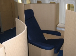
Once Forpeople and Tangerine had finalised the concept they moved quickly to full size card models in order to evaluate whether all the various elements including footstools, stowage areas and bed positions would fit within the space.
“We build a significant number of card models to progressively and more accurately describe the design,” explains Darbyshire. “Obviously the more prototypes that you have early on in the process, the more robust the design will be in the end. So this programme was designed to build prototypes very early on and we were under a lot of pressure to evaluate the concept and nail down as many of
the hard elements as possible.”
Alongside these card models, a number of full-scale visual appearance models were also built and fitted out in BA’s dedicated cabin development centre. Not only did they give a good insight into how the whole design would come together but it also allowed the Working Group and key stakeholders, including Willie Walsh, to see how the project was progressing. “When the team showed me the mock-up
of this cabin for the first time I can say that I was genuinely impressed and I am a difficult person to impress,” said Walsh at the launch event.
Sitting pretty
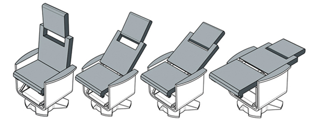
Kinematic study of the lay flat seat
Following the concept design work, Forpeople and Tangerine were asked to essentially ‘down tools’ on the design and concentrate on producing a detailed specification document to send to the three principle seat manufacturers who would formally tender for the project.
“This document defined the seat geometry in great detail,” confirms Darbyshire. “It defined everything that we wanted to have – all of the features of the seat in as much detail as we possibly could across all of the different elements.”
One of the key things that the team was able to achieve with the new design was a 60% wider seat, which is now 31 inches across and 6ft 6” long when fully flat. So, all this information as to how the seat and arms go down to form a bed surface together with how it actually connects to the aircraft itself were included in this document.
“We had to make sure that there was perfect integration between what we are trying to achieve visually and what the seat manufacturer could make given the tooling they were able to use and the materials available. From that we built tighter and more robust data that gave the seat manufacturer a package to initially plug their engineering into,” explains Darbyshire.
B/E Aerospace won the tender and its Super First Class division, which is based in Tucson, Arizona, became the chosen supplier.
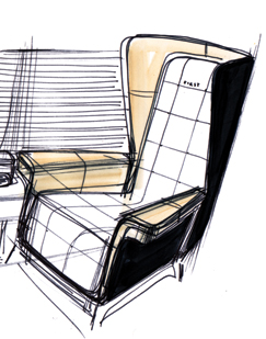
The team then embarked on a significant amount of work with B/E that involved both agencies producing an enormous amount of hand drawn sketches to communicate each element with the engineering director.
“There were copious amounts of sketching just looking at the details, defining how all of those bits go together and what they become. So literally, for every aspect we have drawn a series of elements and defined what they are, discussed how they are being made, how they are being finished, agreeing the process for that and then we would build final data in Alias to give B/E as a reference to which
they would then build their data and the master data in Unigraphics.”
In fact, this required Darbyshire and Stevens to fly out to Tucson together literally every other week, which would continue later on in the project to review and discuss the pre-production prototypes.
Master touch
One key aspect of the design that proved to be rather challenging was the distance of the passenger from the 15-inch IFE (in-flight entertainment) touch screen on the seat in front. In order to get this just right, BA once again enlisted the help of human factors consultancy Davis Associates, who had worked with them previously on a number of projects including the configuration and comfort of the Club World seat design.
As each seat is different, and the range between the passenger and the screen differs from one to another, a lot of evaluation work had to be carried out in order to discover an acceptable reach and also ensure that the quality of the screen image was good enough.
“Obviously the challenge was to find the best relationship between viewing distance and reachability,” explains Darbyshire. As a result Davis Associates built a very substantial rig and carried out extensive consumer research in order to define the best position to sit the screen at that would work across all the different seat positions.
All this evaluation may seem excessive but, as Darbyshire argues, it’s too big a project to run the risk of not doing it. In fact, as Stevens says, “The project’s success depended on the consideration of the whole experience, threading those elements together consistently and obsessing over the details of that experience that the team knew would really matter to First customers.”
Blind faith
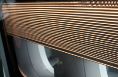
With all this work and consideration going into every detail of the design when asked what their best feature is all three – Darbyshire, Stevens and Cooke – said that without question it is the sidewalls: a double window that incorporates electronic blinds.
“For me, it’s the sidewalls because they were a challenge from the start,” says Cooke. “It’s in an area of the seat where you can’t say that it actually brings in revenue so, not only was it a challenge commercially to get the business to buy into the idea but it was also a challenge from a product development point of view.”
Some of the reasons for this included sourcing the right clear plastic in order to create the desired window effect as well as the fact that the curvature of the plane in Zone A becomes quite severe towards the front so it meant installing a blind round a curve. However, it was all worth it because according to Stevens, the whole idea of the sidewall windows was to frame space and give the passenger a sense of real ownership over their window – something that they certainly achieved.
“I think there is no doubt about it – when you walk into the cabin it’s the sidewalls, that give you the real ‘wow factor’,” says Cooke.
Smoothly does it
While the engineering development was taking place at B/E, including all the extensive dynamic tests and ensuring that all the aircraft rules and regulations were met, Forpeople was liaising with many other suppliers in order to finalise the finer interior details such as the integrated cabin lighting and double-stitched leathery upholstery.
“Forpeople were responsible for creating 3D A surface data for all aspects of the suite and cabin, even down to the modelling of the red accent drinking glass and amenities products onboard. Throughout the course of the project we were releasing and managing data between suppliers in Tucson, Seattle, New York, Miami and Milton Keynes,” explains Stevens.
“As all our Alias modellers are leading automotive A surfacers, we had to fight for the quality of surfacing to be translated (to parametric) in the correct way by the supplier. This was a difficult process (and difficult to justify the effort) but my retort is always that ‘you wouldn’t ask an engineer to surface an Aston Martin’.”
In the end, despite it being a very complex and involved project, everything came together and BA now has a First class cabin it can be proud of.
It is currently in the process of rolling out to all 747 and 777 aircraft. So far, according to Cooke, feedback has all been positive and at the launch event there was certainly praise from Bill Nighy, a British actor and comedian as well as a frequent BA first class passenger, who said, “When I travel, BA is my first choice every time. The new First cabin is fabulous – classic and understated.”
www.ba.com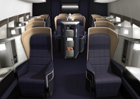
British Airways’ new luxury first class cabin takes to the skies


